Is brand logotype? An apparently naive question, but one which touches deep inside convictions and the existence of companies.
First of all, let us use the term logotype as a generic term for all its variations: imagotype (image + text), isotype (only image), isologo (text and image mixed into one single thing) and logotype (only text). When we say logotype, we are indicating any visual composition, with or without text, with or without image, that represents a company or a product.
The logotype is a powerful image that appropriates the existence of a company. In a gross analogy, the logotype is a person’s face; it is neither the brain, nor the limbs, the way they talk, their temper. When we think about someone, we always see this person’s face. From there, we connect a series of experiences that makes a human being: the clothing style of their preference, the music they love, the family that surrounds them, career, crazes, skills and so many other attributes.
From here on, we can define logotype as the fundamental entryway to the being of a brand. It does not say everything (actually, literally, it says very little), but clearly has the importance of connecting the entity that it represents to the world.
The process of drawing the logotype is more and more banalized: quick, easy, copyable. Nowadays, especially with the artificial intelligence technologies, it is absurd to demand that your logotype carries all the responsibility of transmitting the essence of your business or company. The volume of visual information in the current days is so stratospheric that the possibility of companies plagiarizing each other mutually and unconsciously is almost a constant.
So how can my company have its own “face” in a time of standardization and facial harmonization?
A branding project (brand) cannot be restrained to think only about the logotype – or the face of the company. There are other layers of existence, both in the visual and textual aspect that must be developed jointly.
Being beautiful is not enough, it must have something to say
In the visual aspect, the elements that will grant beauty and personality to the face (logotype) are the main ones, because they will create what we call the system of visual identity, the brand’s complete and complex visual environment. For that, it is necessary to create countless graphic layers that, together, will form a unique communication and with its own personality. Just a logotype and a color (that blue color that “inspires” safety) do not make up an ensemble and speak too little on the day-to-day for the communication of a brand that is consistent, solid and has personality.
Do you want to delve deeper in this subject? It will be a pleasure to help you in the branding strategic process. Send us a message!
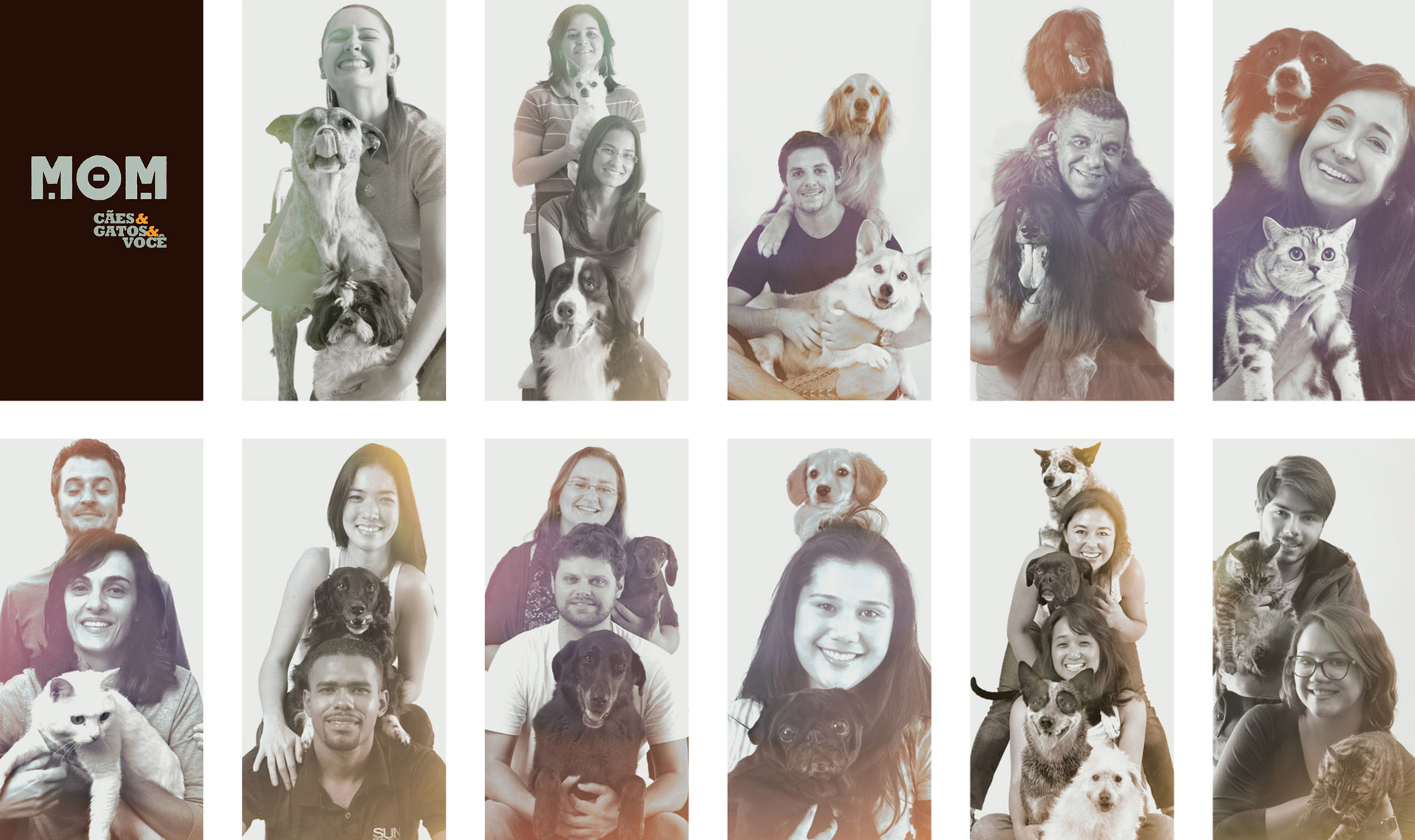
Cuts from the MOM brand project
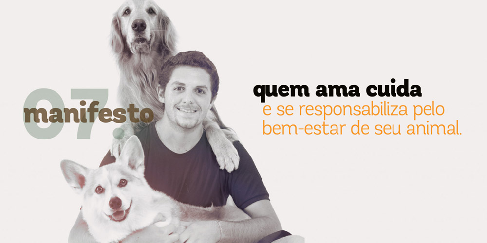
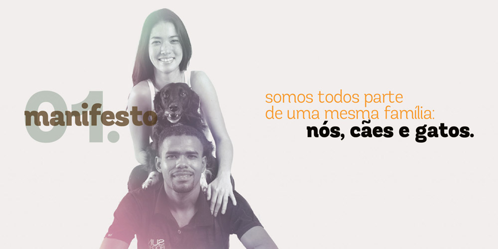
WHAT IS THERE TO SAY? MOM was born with a manifest, proposing a rupture and a commitment in the relation with cats and dogs: retake the pet’s natures and perceive their union with humans as an animal family unit.
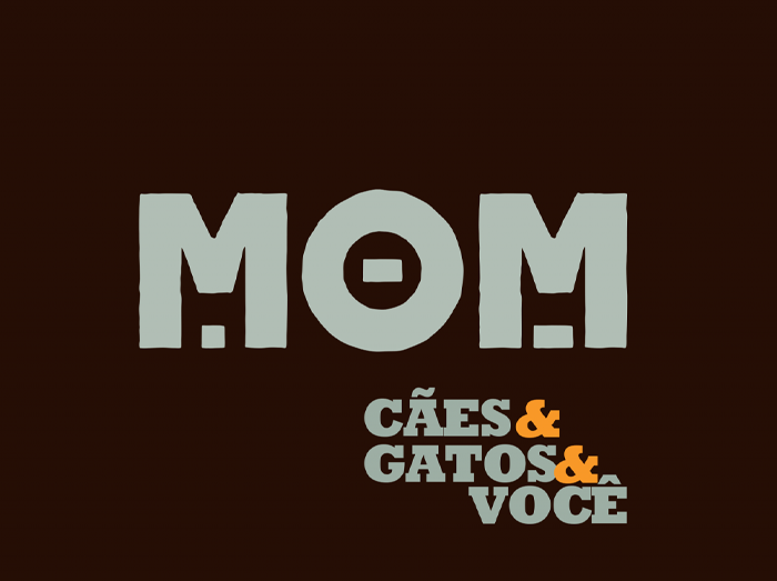
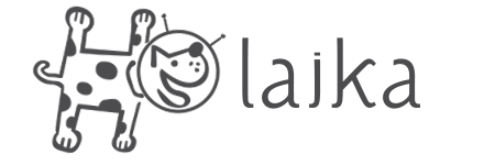
The logotype developed by Laika for MOM – dogs, cats possess a series of elements for the brand’s significance. Composed of its own typography and the effect of the silhouettes of a dog and a cat in the letters M. But it is not enough to tell all the brand’s narrative.