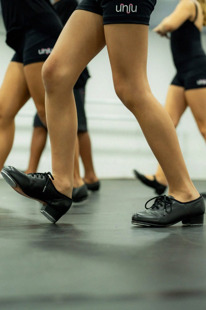
UNIU was born as a dance, movement and art school: the result of an intense dive into the essence and culture of a school with more than a decade of history. Its origins are in the tradition of classical ballet and, with the maturation of the business model, it experiences the movement of transformation: expanding its pedagogical project to other aspects of art and sport, which establish in some way an affinity with ballet.
Laika’s challenge was to translate these changes into a new brand and language, implement the transition and direct decisions during the process, preserving the community’s original connections and the link with its history.

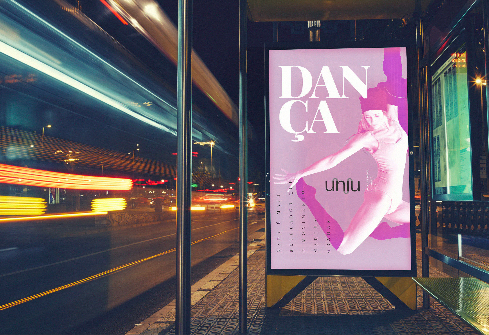
A brand on the move
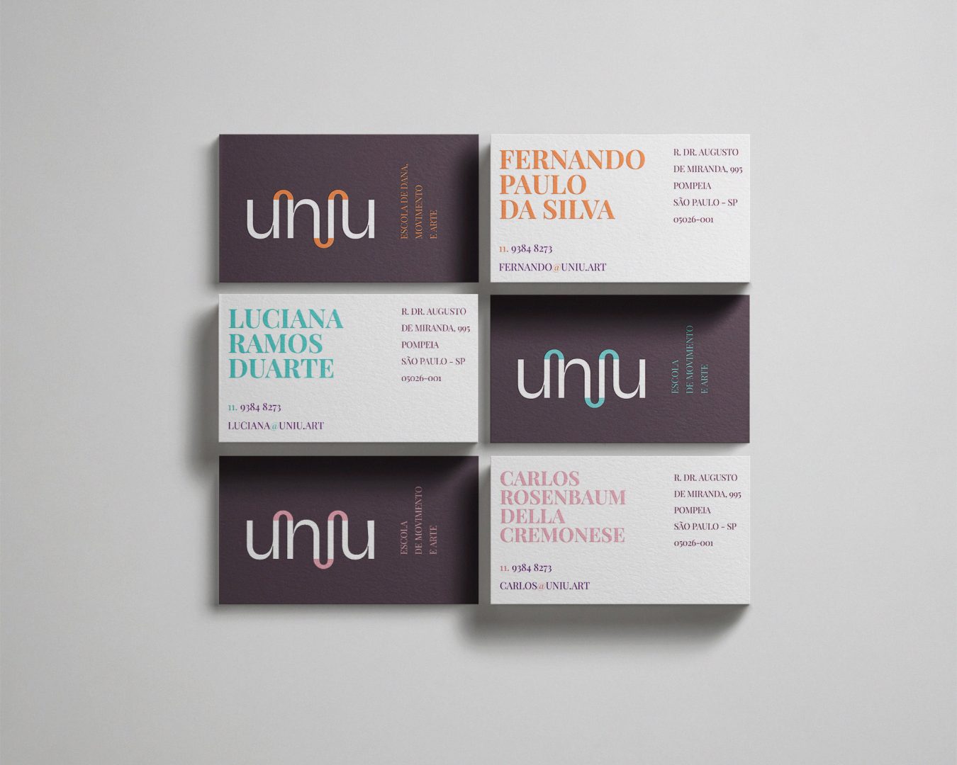
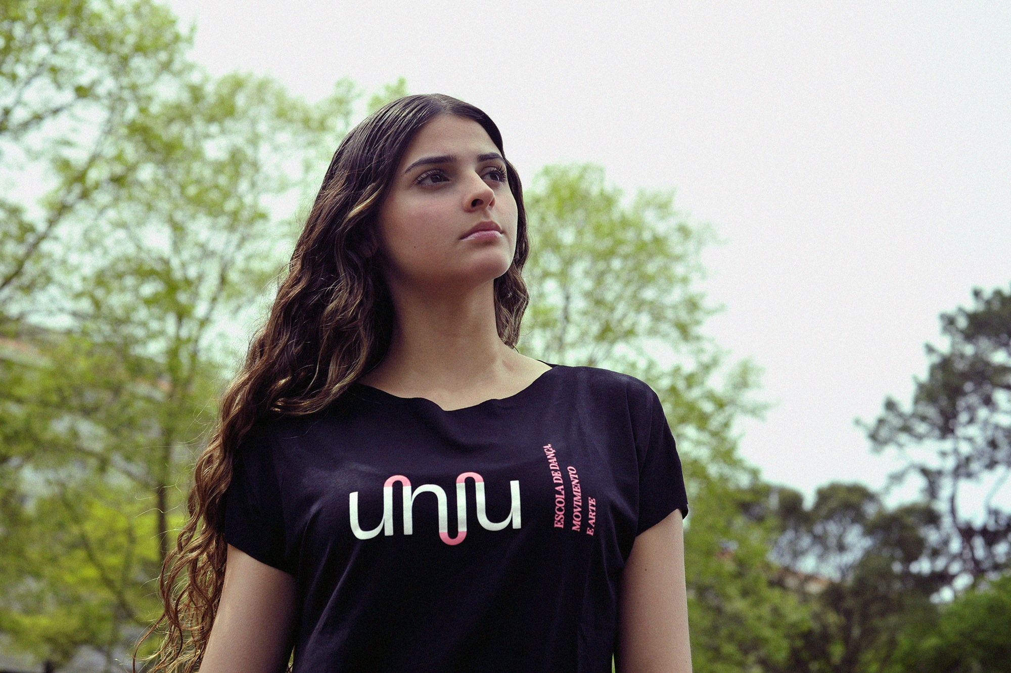
The UNIU brand is a continuous representation of connection – between people and the modalities of art and movement – manifested in the typographic characters of the name, joined by arcs. The representation is a literal depiction of the connection between pairs and, also, movement.
Community in constant movement
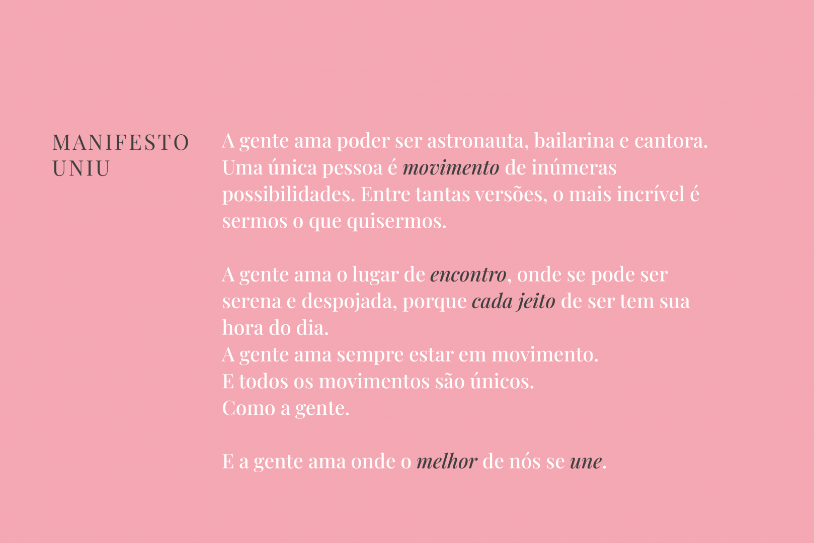
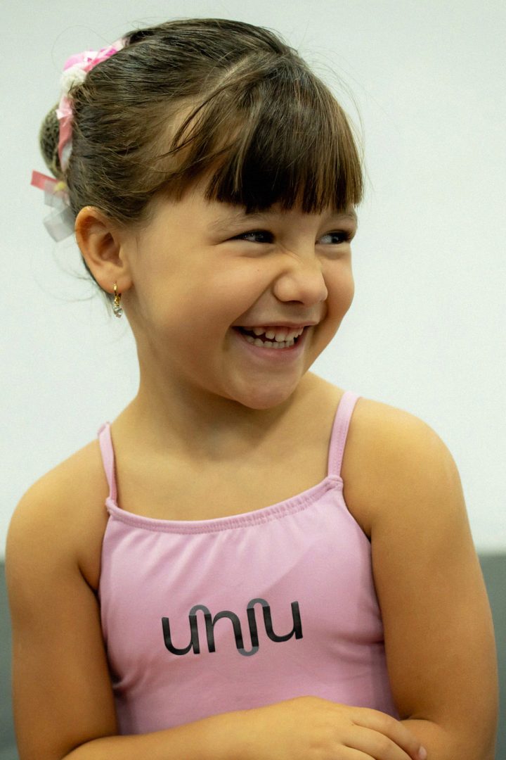
The UNIU manifesto is the synthesis of the feeling of belonging to the UNIU community; This feeling is common to people who live the brand on a daily basis. Because they are part of a community, they love being together and experiencing art and movement.
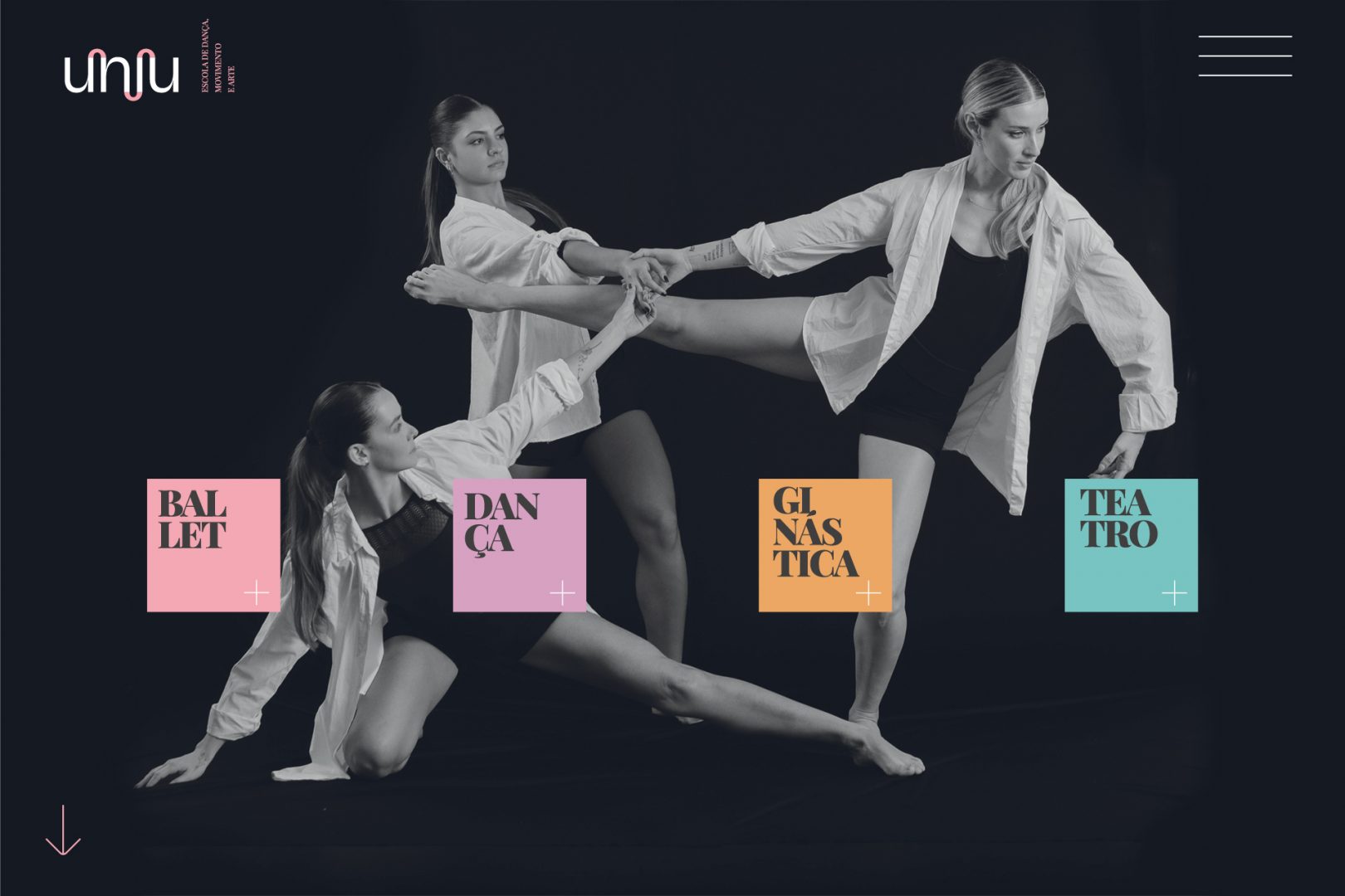
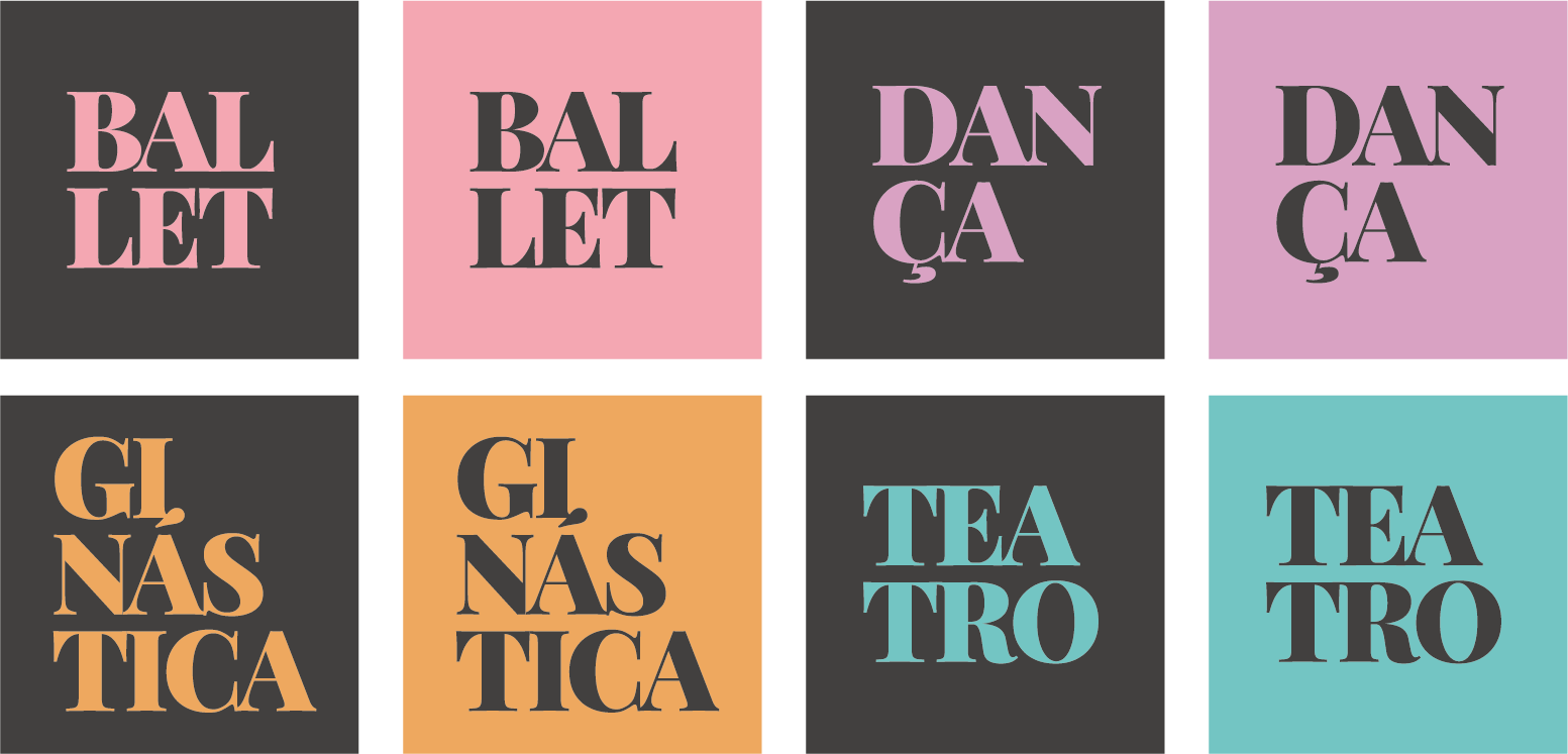
Modalities
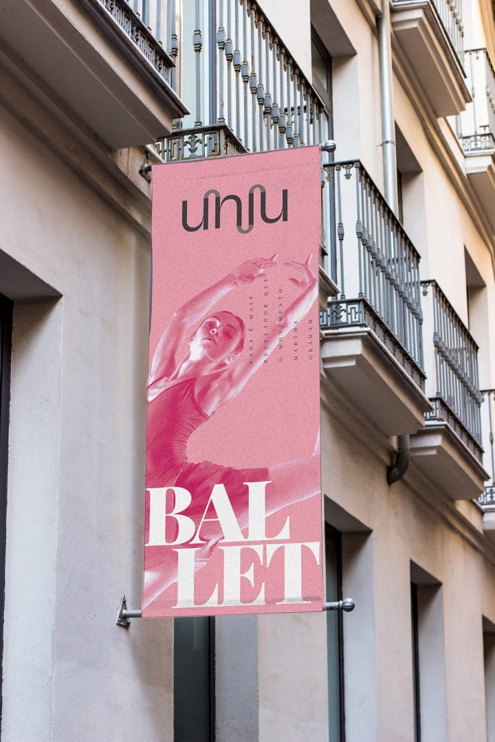
The movement of the brand’s colors fluctuates between the institutional and the colors that identify the modalities. The colors, applied punctually, build the polychromy of ways of being and creating.
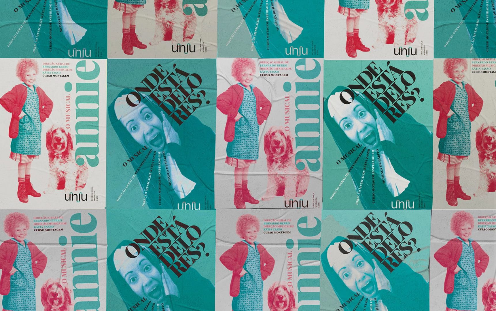
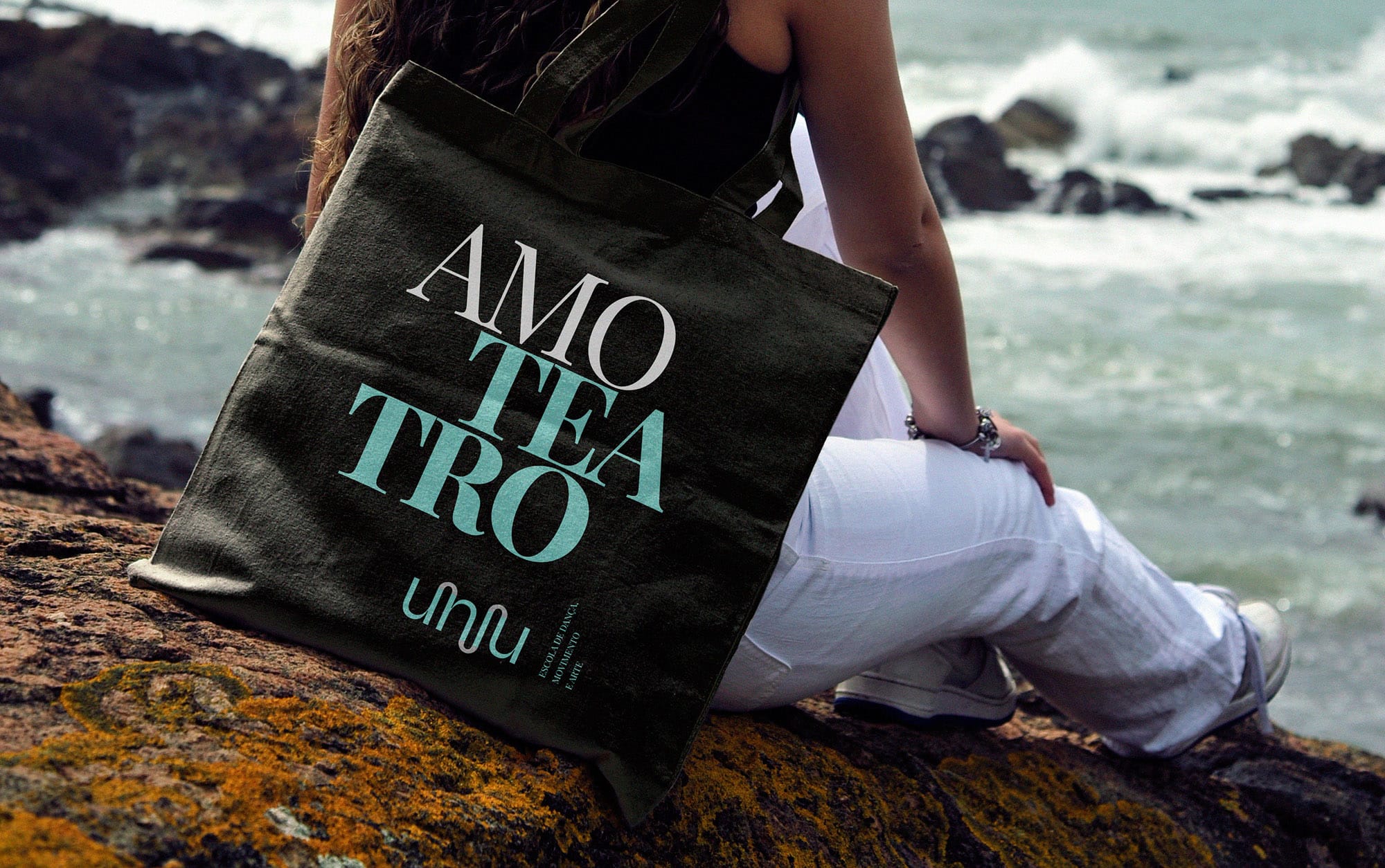
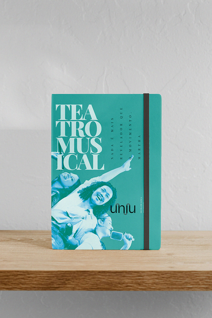
United shows
The school puts on dance and musical theater shows during the school year. Reinterpretations and adaptations of classics are produced and, in this process, the brand connects with the theater tradition. To preserve the brand’s identity and imprint the brand’s signature on the shows, Laika developed UNIU syntax and visual logic for the construction of seasonal projects and its own graphic specificities.