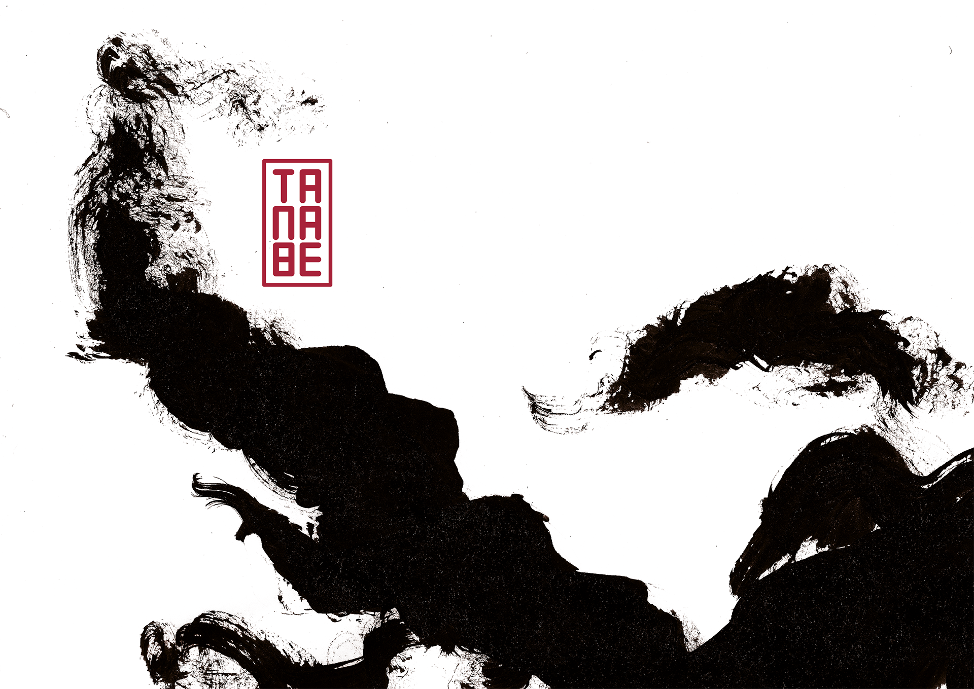
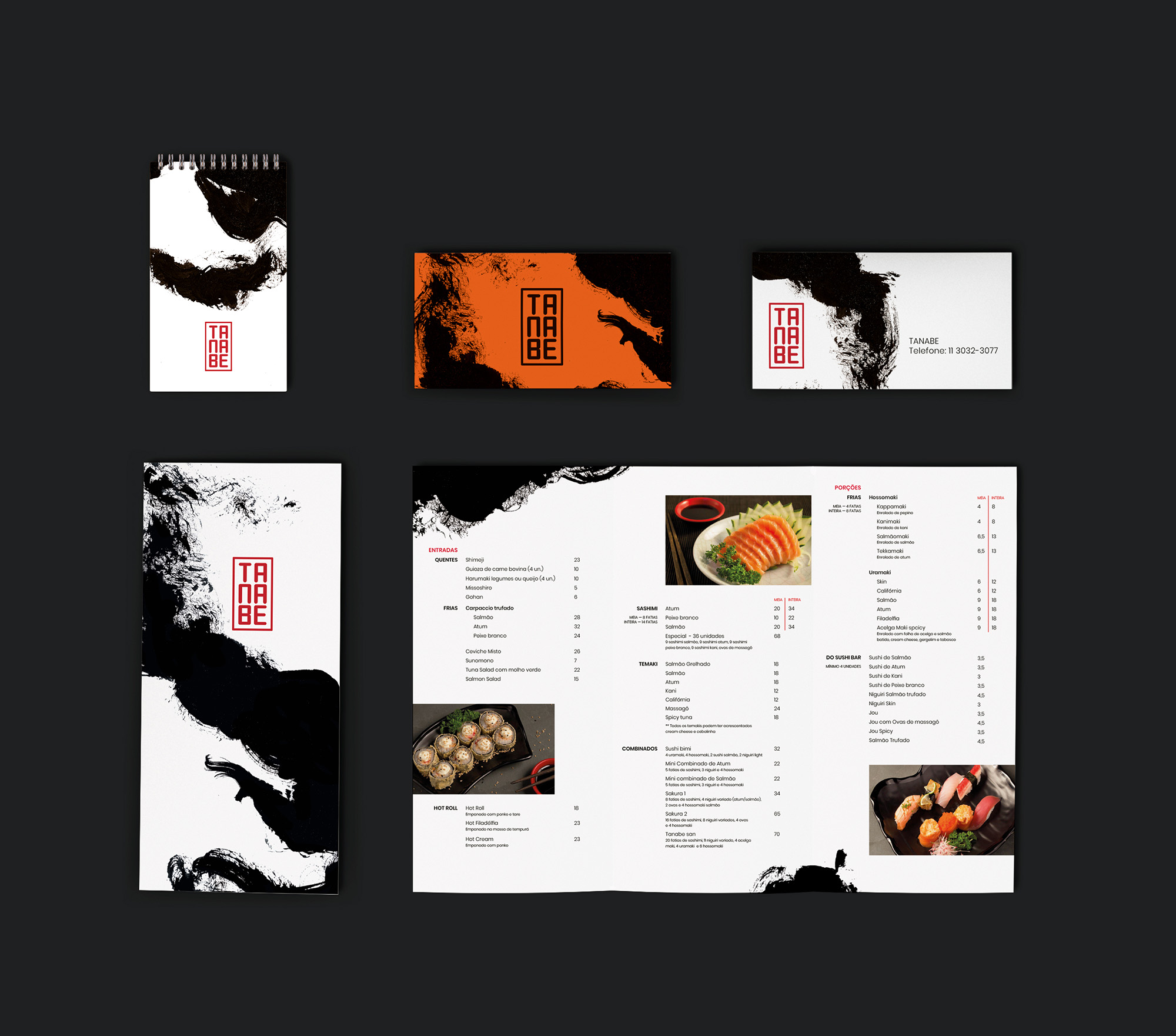
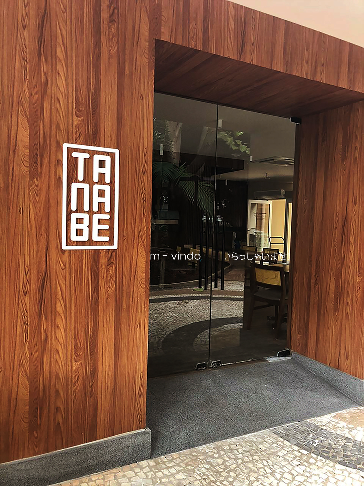
Tanabe’s logotype has a graphic structure inspired by inkan, a signature record through what, in the West, we call a stamp. The inkan acts as an authentic signature and has legal value.
![](https://laika.pt/wp-content/uploads/2020/11/TANABE_01_Final.jpg)
![](https://laika.pt/wp-content/uploads/2020/11/TANABE_LOGO_Final.jpg)
![](https://laika.pt/wp-content/uploads/2020/11/Tanabe_02-1776x1080.png)
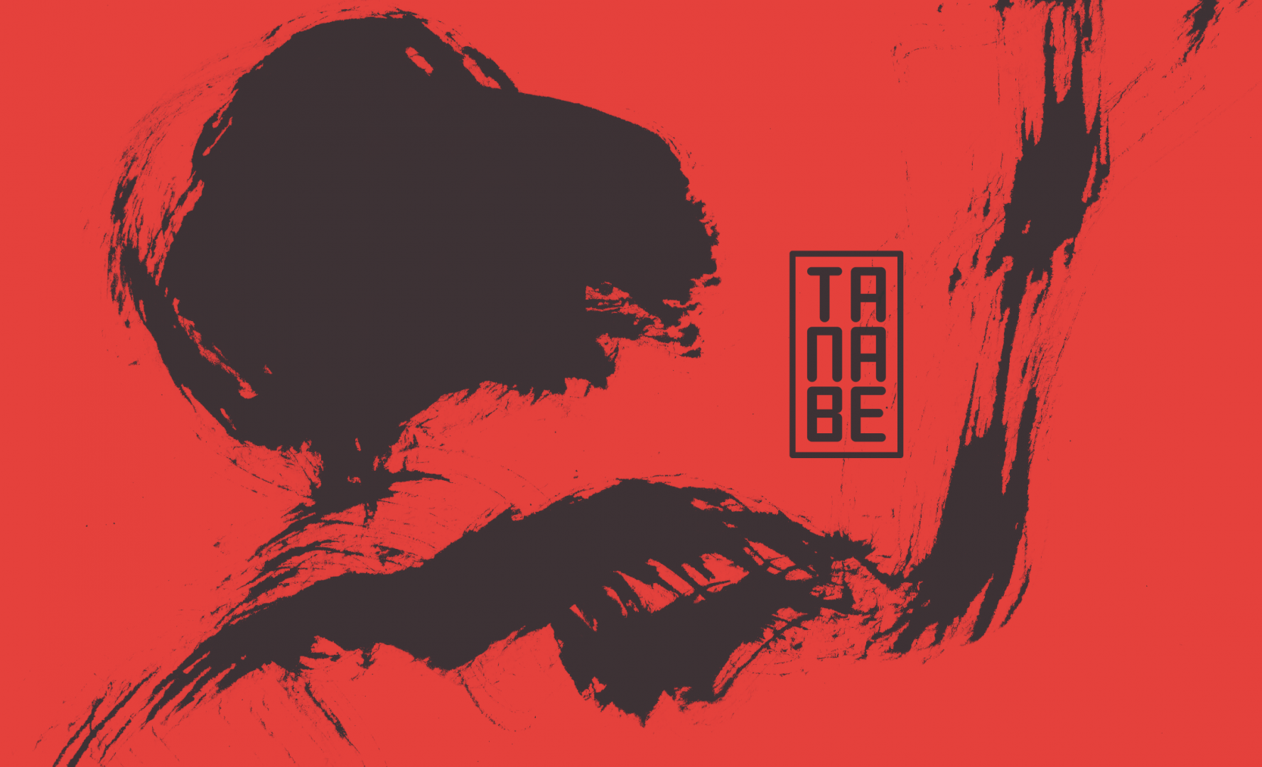
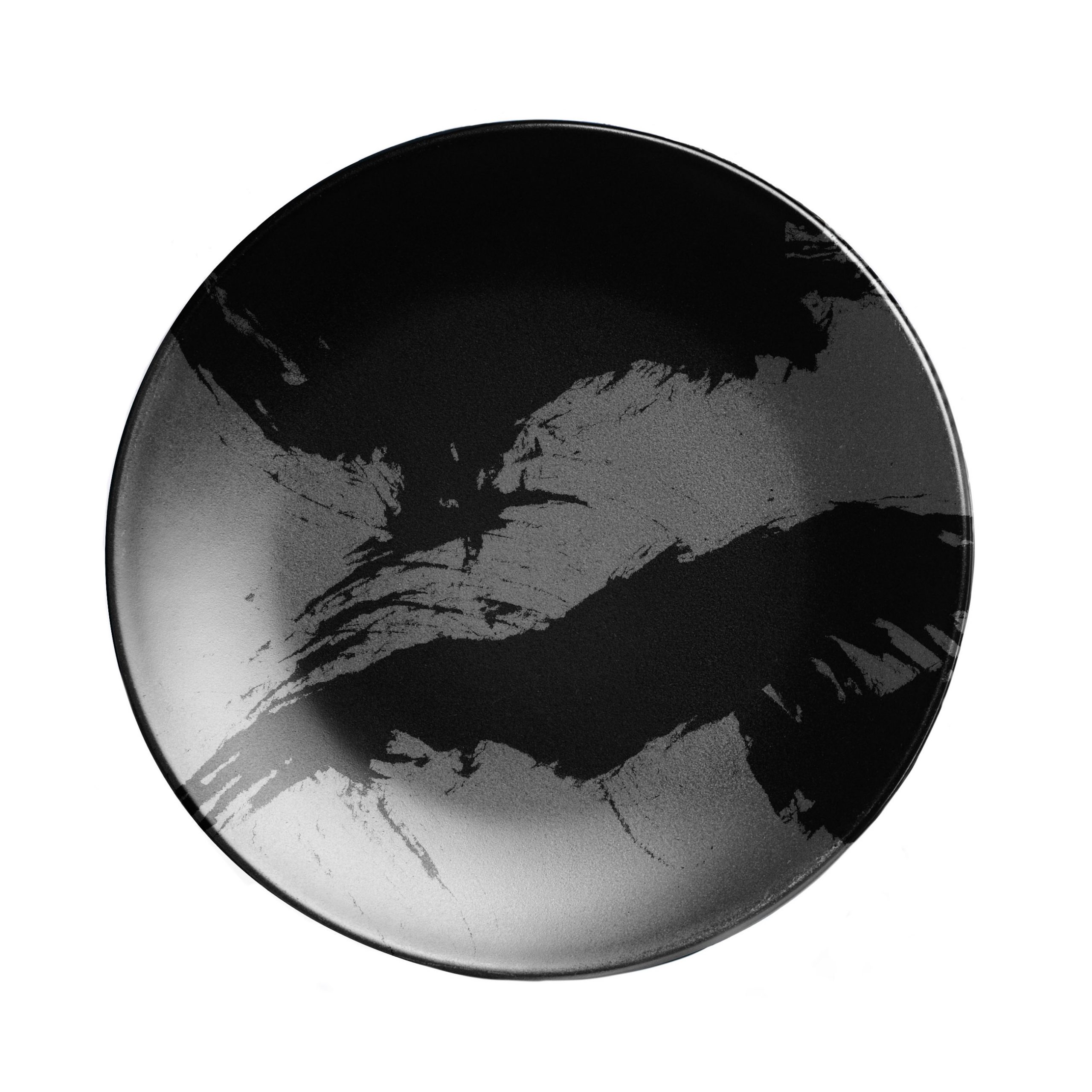
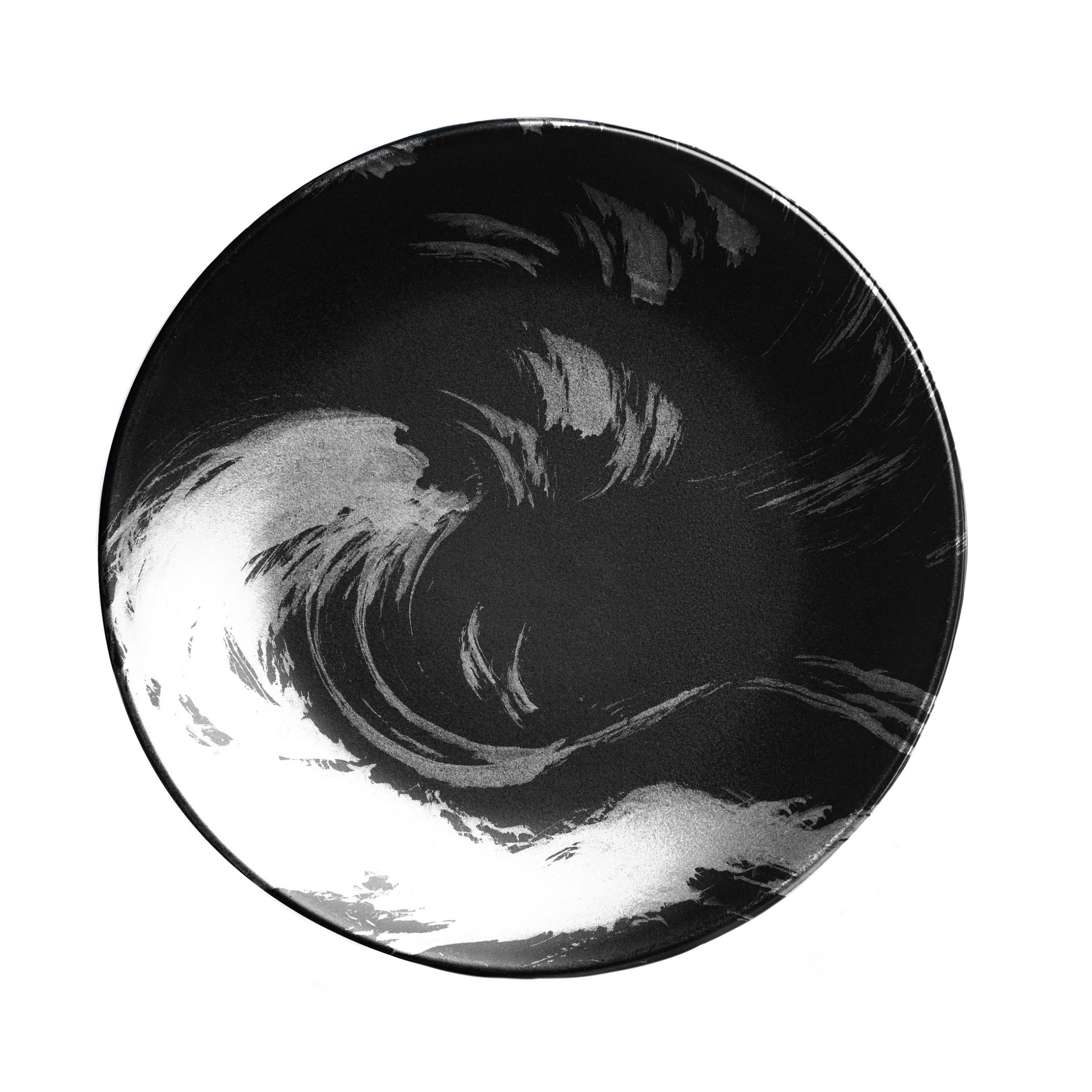
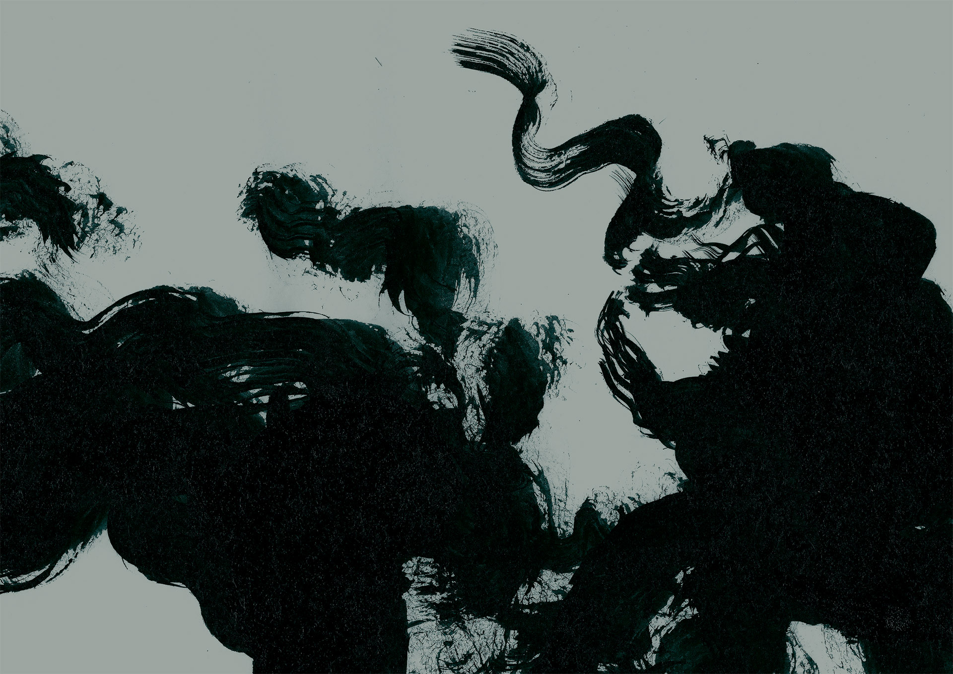
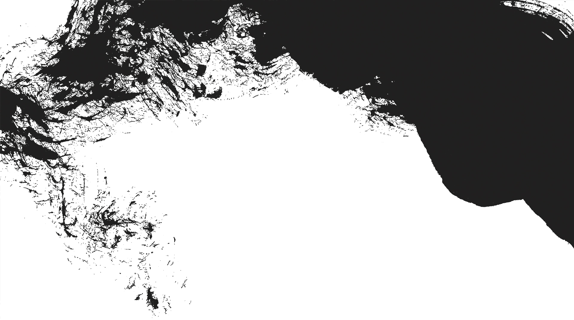
Inspired by the art of Japanese calligraphy, shodo, Laika released the paw and let the brush create expressive and dynamic shapes for the Tanabe visual identity.
![](https://laika.pt/wp-content/uploads/2020/11/PRATO_fundo_branco_01-1-scaled.jpg)
![](https://laika.pt/wp-content/uploads/2020/11/PRATO_fundo_branco_02-scaled.jpg)
![](https://laika.pt/wp-content/uploads/2020/11/AP_Dragao_02_SHODO_01.jpg)
![](https://laika.pt/wp-content/uploads/2020/11/AP_Dragao_02_PB_BOLD.png)
![](https://laika.pt/wp-content/uploads/2020/11/TANABE_Cardapio-2.jpg)