
The biggest impact of digital technologies in our lives is the speed. Nowadays trends are immediate and they disappear in the blink of an eye. Literally. The new generations reflect this instability: they fluctuate rapidly between different preferences and aspirations. What trends now may become obsolete in a few minutes.
What about the companies? How can they follow this movement without losing their essence and culture, without leaving behind something they built for so many years?
A few decades ago, brands remained the way they were conceived for a long, long time. To change a brand it used to take great investments: print business cards, notepaper, envelopes, folders, everything too expensive.
But not today: a company can reboot its existence; it can restart its social media accounts from scratch in just a few clicks. The brand may be substituted and quickly mere traces of the original brand will remain.
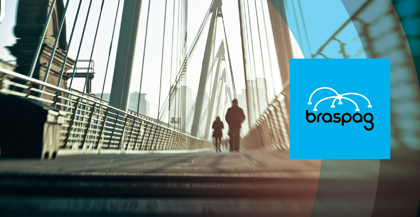
It is the speed of our time! Let’s give an example of ours: in 2012, Laika was hired to develop the new Braspag brand, a company that owned 65% of the gateway market share in Brazil, which was acquired by Cielo.
After a little more than six years, Laika rebranded Braspag. There was a transformation in the gateway segment in this small period. And they were drastic changes. Braspag increased their revenue significantly, but lost market share, due to the fact that the segment had expanded tremendously and new players har surged, including companies from Europe and the USA. In other words, the segment went through an earthquake of changes.
The Braspag transformation was made in a structured manner and involved much more than a change of appearance. It involved understanding what existed at the time in terms of brand culture and business projection to translate into design a pulsating existence.
In the context of design, the rebranding consisted essentially in simplifying the logotype: dispose of the icon, that represented connecting bridges (gateway) and invest in a proprietary and timeless typographical drawing that resisted to the metamorphosis of the technology segment. The new logotype survives the trends and moods of time.
Is rebranding to “change” a brand?
To us, rebranding is not to change a brand. A brand is what it was built. When Laika gets involved in a rebranding process, it tries to understand what it is at that moment. And also understand what is projected for her in the future. If there is change, it will be a consequent completion of our work with the client, from the basis that we structured. Rebranding is reinforcing an existence and projecting ahead carefully drafted plans.
Of course that, in rebranding, invariably silent necessities and aspirations are revealed by the chaotic rhythm of everyday life. It is what boosts transformation. First of all, in the branding or rebranding process, it is necessary to separate two things that are often mixed and ensure they are dealt with in different layers: text and image; concepts of brand and visual identity/logotype. The latter is the visual representation of the former. The brand is a collection of passions, beliefs, human and comercial relations, stories, desires, products, problems (a family that does not fight has a problem), etc. Mix it all together in a cauldron and we have a big stew of life! With design, comes the visual translation of this existence: that logotype that was born with the company’s foundation, the specific color that identifies it or the usage of a style of illustration.
Therefore, changing a brand involves two levels: the image and the word. The former accompanies the latter, because it is root in its real meaning: it is deep down, from the beginning. It is worth noting: to feel current, the right thing to do is not to wear the trending sneaker or pants! In a very simple analogy, we must wear the clothes that make us feel like ourselves! Before anything, we must be satisfied with who we are. The clothing is a reflection of that.
For an efficient rebranding process, the first step is to understand the stew we cultivated day-to-day, to understand the essence of a brand. Does it maintain the same taste from the beginning or has it changed a lot? Does the recipe require improvements, new seasonings? To decipher this delicacy, it is necessary to have a responsible and structured consultancy process to dive deep into the soul of the brand.
Laika, through the Divan method, conducts the client through the path in a surprising and revealing process of immersion. It is a dive in the existence and history of the brand to translate verbally what the client knows, but cannot put into words. From the Divan, we have well stablished basis to construct the new brand image: a collection of graphic elements that, integrated, represent aspirations, ideas and the brand’s purpose.
The final result is a solid project of visual identity (that may or may not involve change or transformation of the logotype). And, fundamentally, a project that is accomplished in the translation of concepts, ideas, values and proposals for the continuity of the brand.
Do you want to delve deeper in this subject? It will be a pleasure to help you in the branding strategic process. Send us a message!
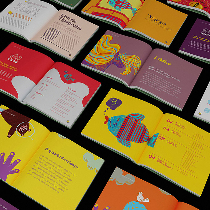
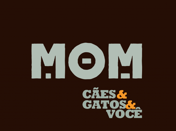
Cuts from the Braspag brand projects
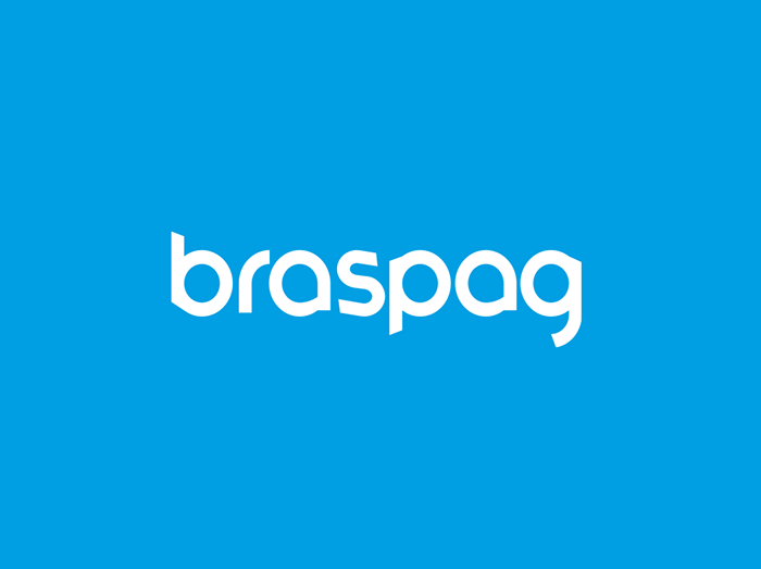
New Braspag brand, 2018: apparent simplicity in the logotype to allow mobility in the visual identity elements that support the brand.

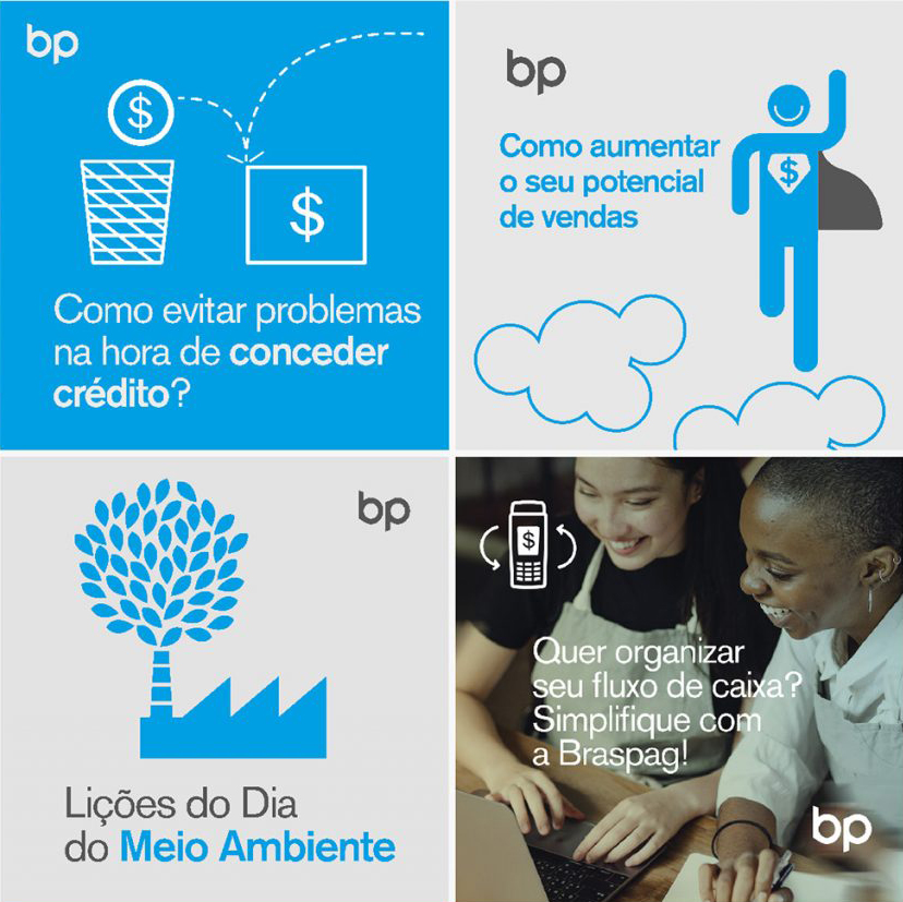
The logotype is synthesized in the monogram version (bp) that creates a communication signature without causing saturation with the use of the logotype. Unfolding in elements of visual identity that, together, reinforce the brand’s personality.