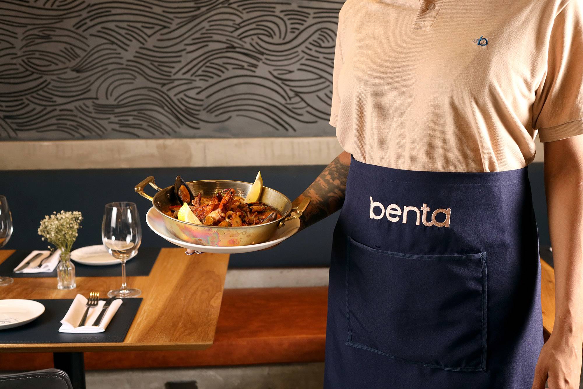
The sea is Portugal and Spain’s territory. The sea, which provoked so many fears and temptations, is present in Benta’s brand, and served as an inspiration to compose a mythical and typical universe.
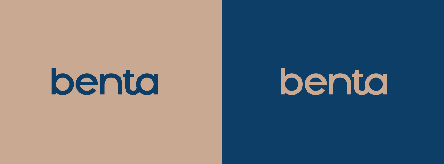
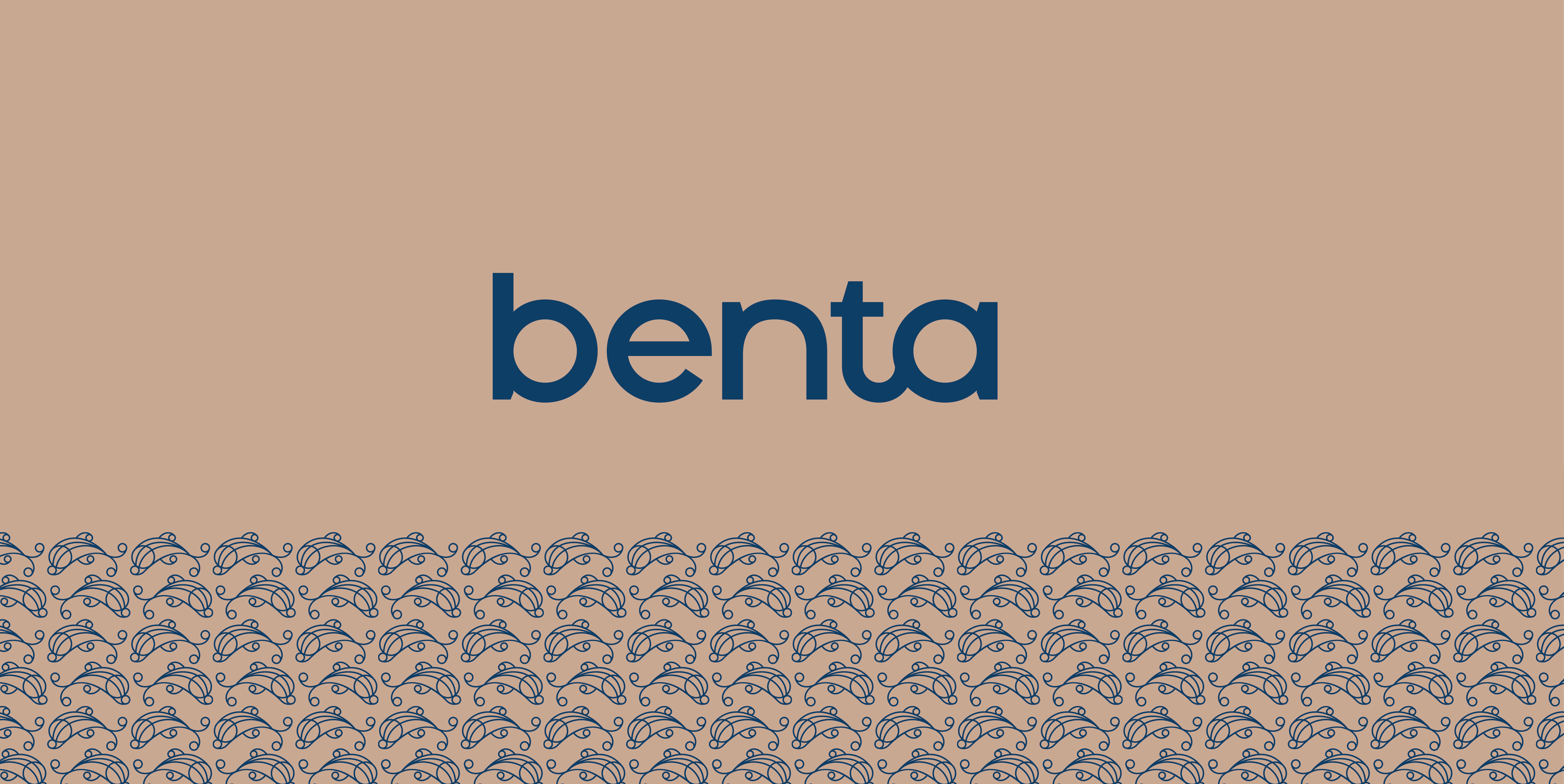
The Benta logotype has a sober and sans serif typographical drawing, practically modernist. The bond between “t” and “a” assigns a classic touch to the logotype. The brand can sign with its monogram, with the traditional signet from other times.
Benta is traditional and modern too, yesterday revisited today – without losing its authentic iberian soul.

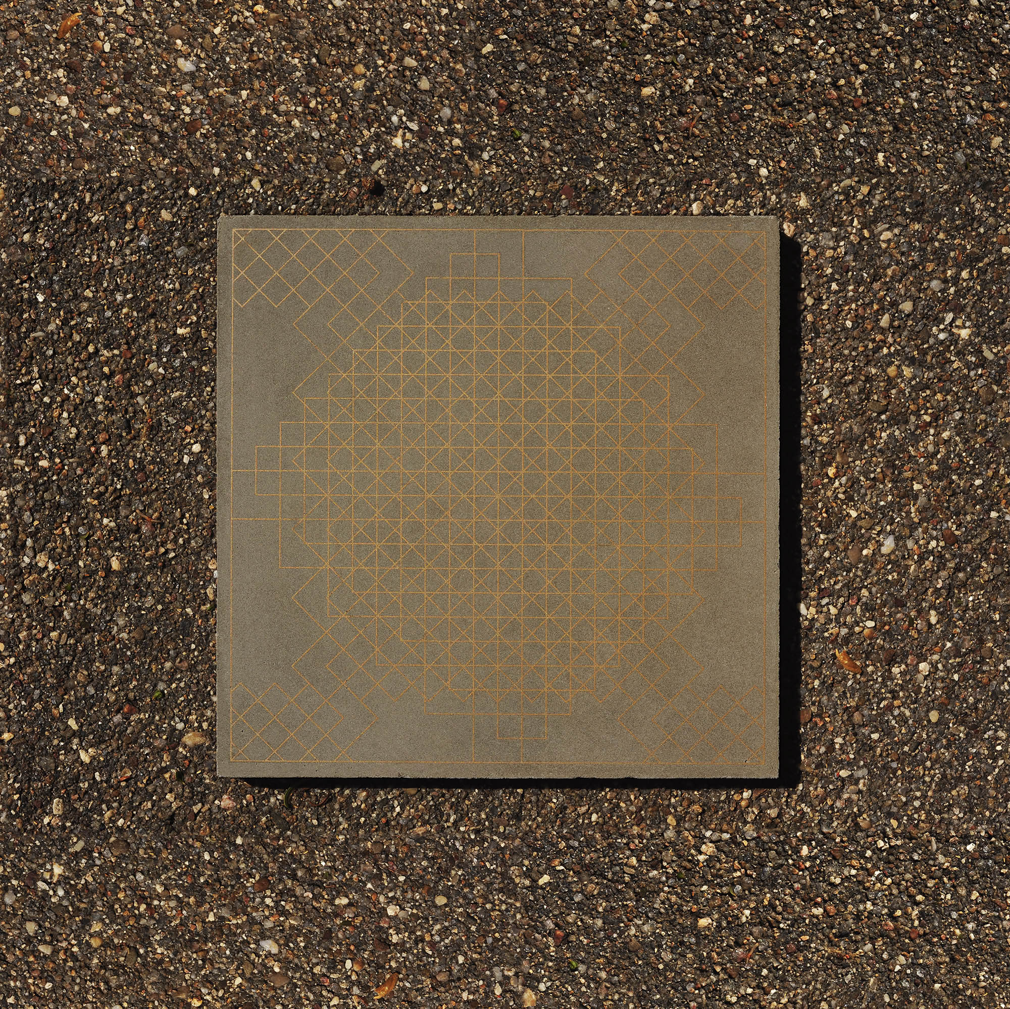
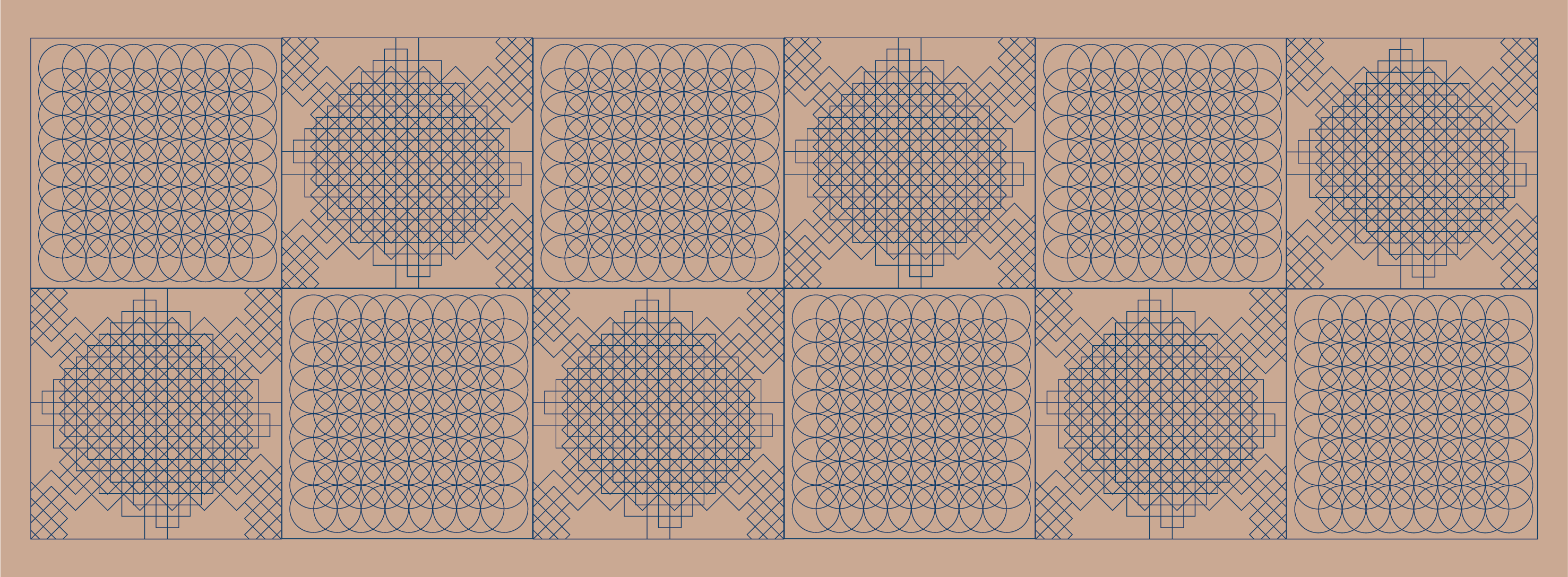
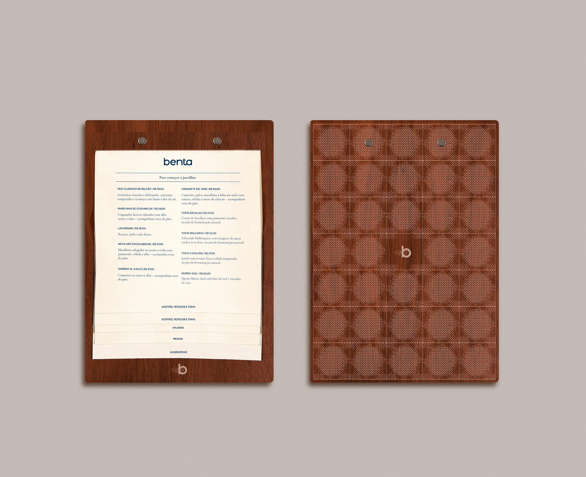
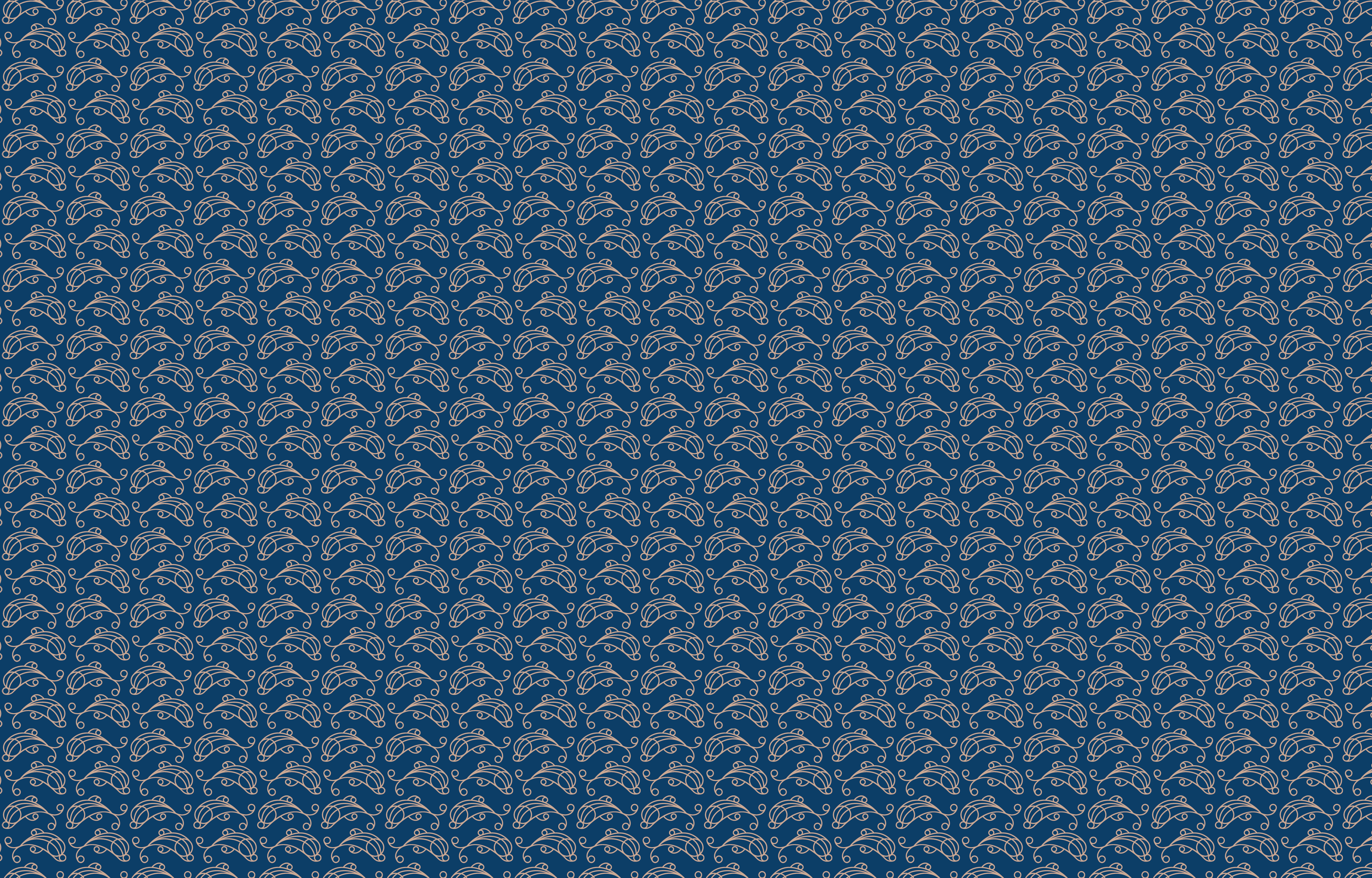
Tiles
Tiles are important objects in Portuguese culture. As a font of inspiration, Laika conceived contemporary reinterpretations of weaving patterns to compose Benta’s tiles. Following that, hydraulic tiles were produced to compose the walls.
The tiling patterns are also applied in other graphic compositions, such as the back of the menu.
Navigate the kitchen is required
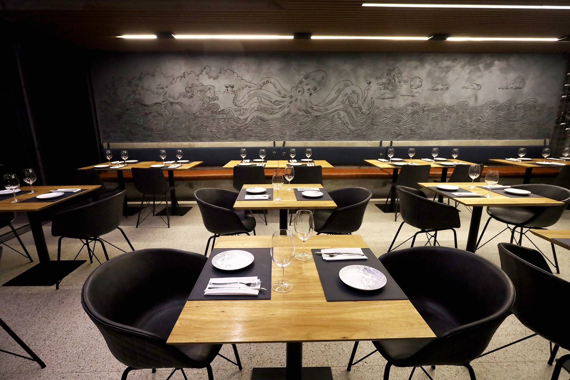
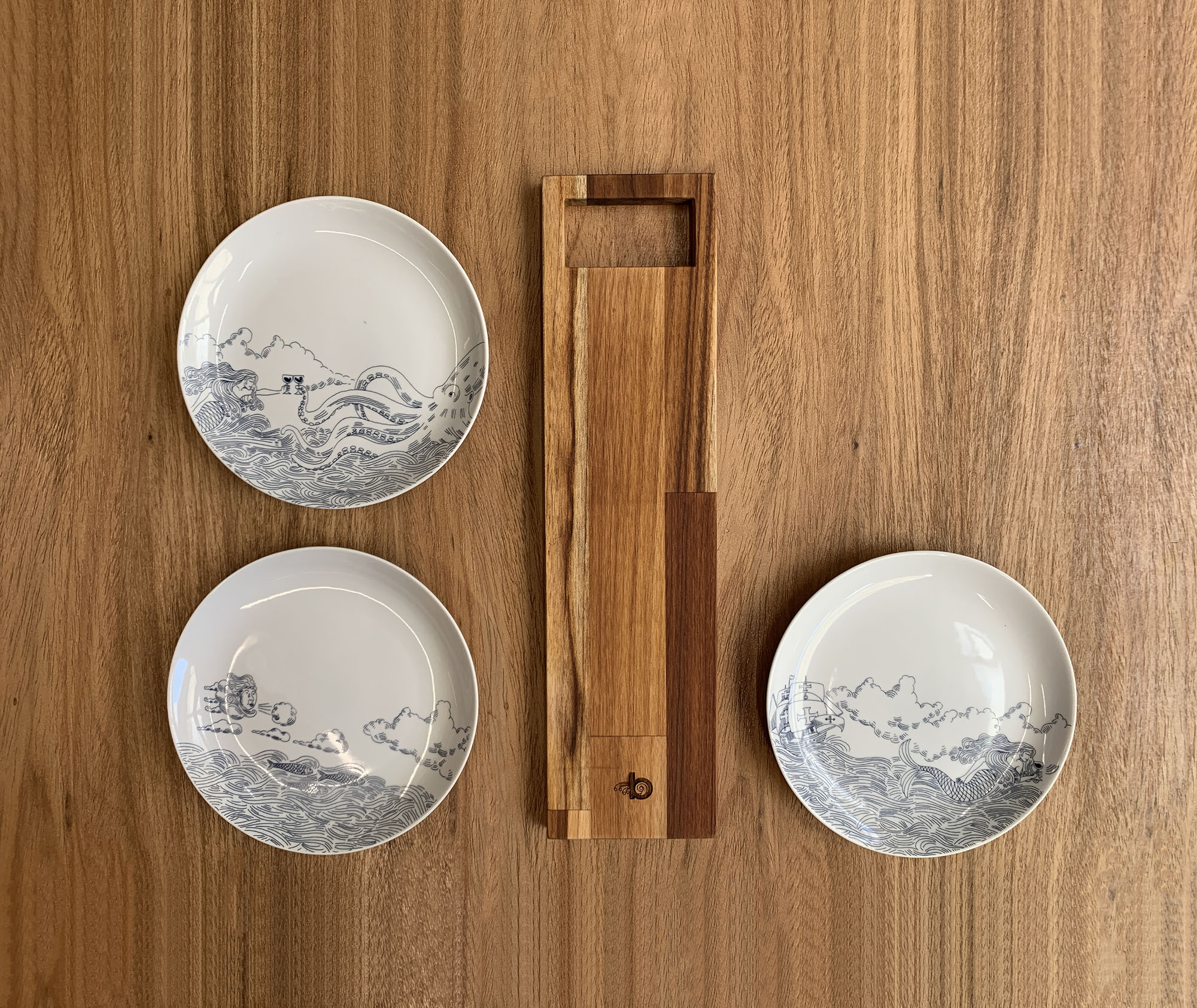
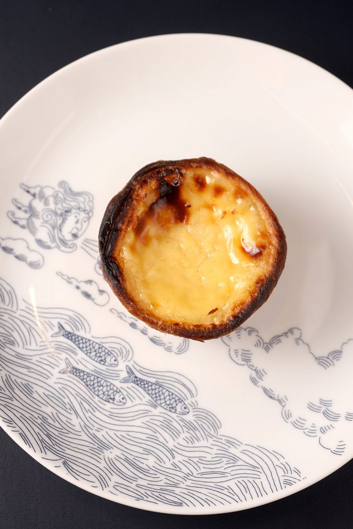
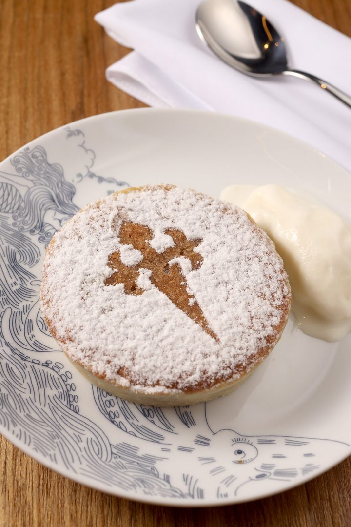
Laika developed ilustrations that represent the sailor’s universe and become elements of identification of Benta’s brand, spreading through the walls, plates, every surface in the format of handmade illustration.
Mermaid, octopus, Zephyrus, caravel, and sardines can be used in individual compositions, clippings from an epic iberian narrative.
Textures and more textures
Fish and octopus were gently drawn to compose the graphic patterns that constitute walls, cloths and everything else one can imagine.
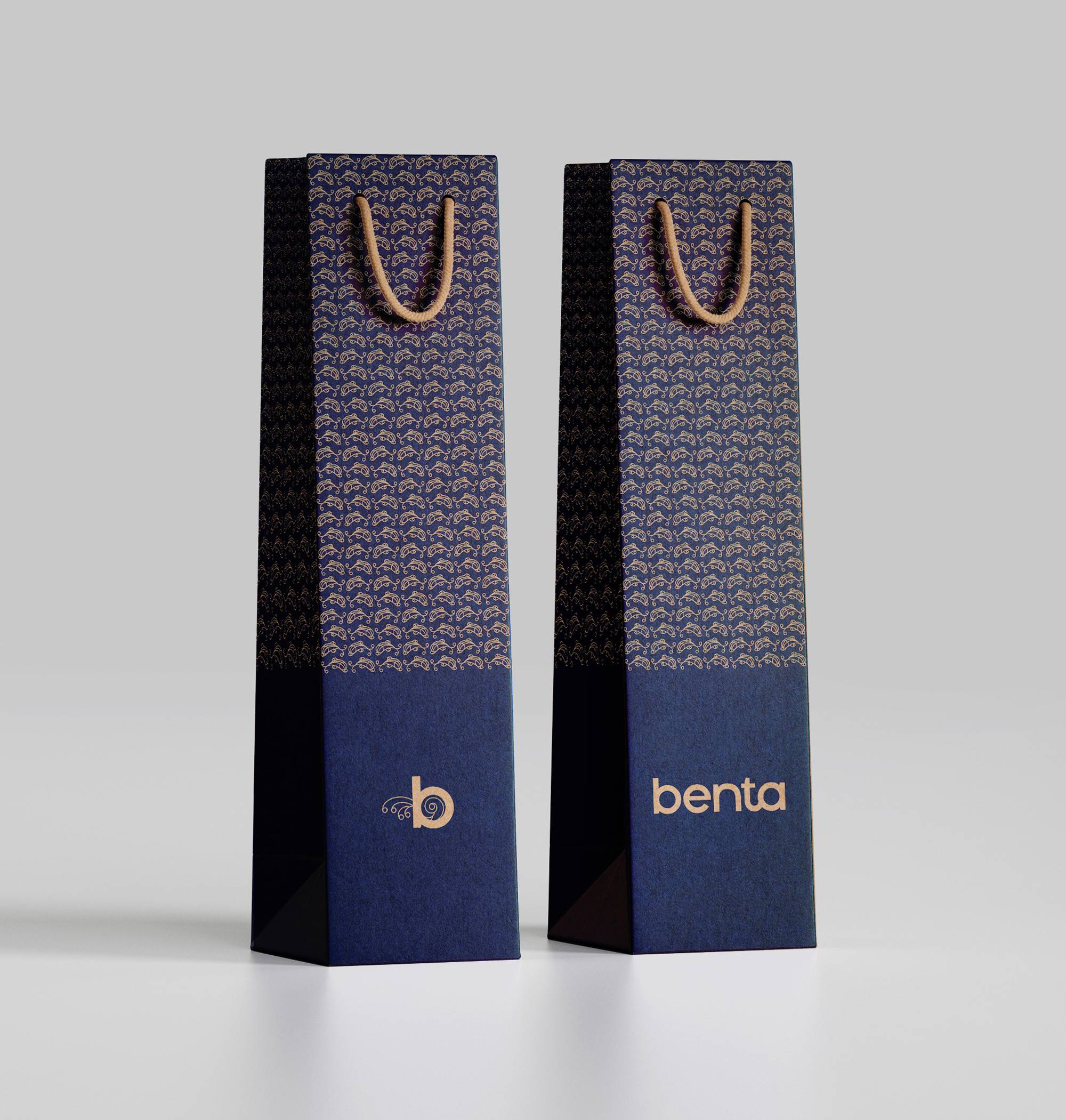
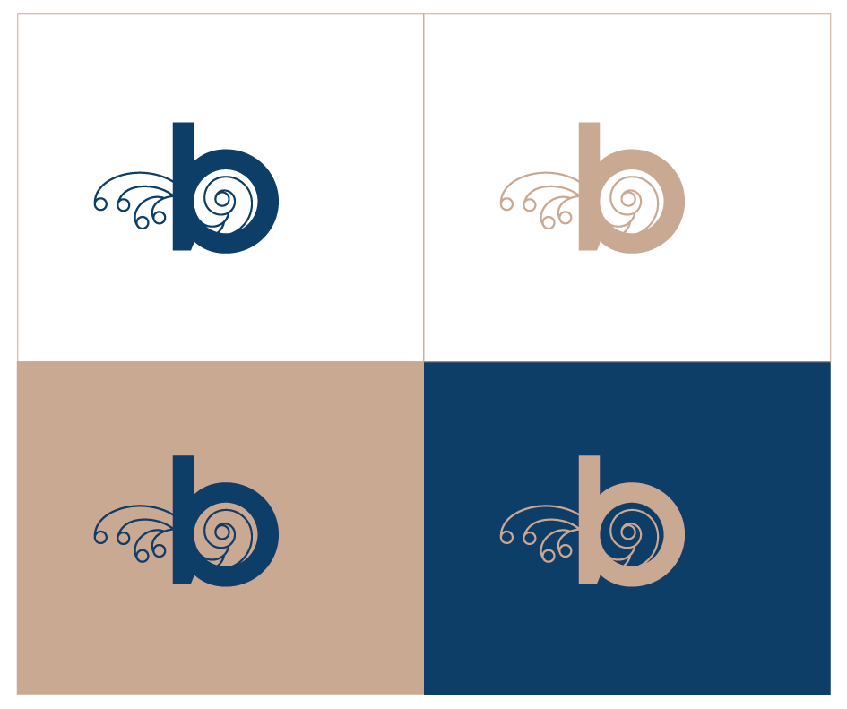
Monogram
The monogram is a simplified format of Benta’s logotype and functions as a dynamic and quick signature for the brand. Its minimalism allows to create a more hermetic and seductive relation of interpretation of the brand, inviting to the discovery.