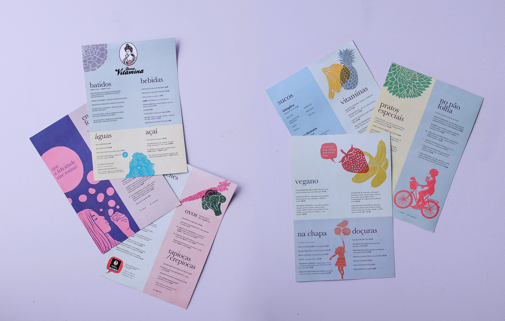
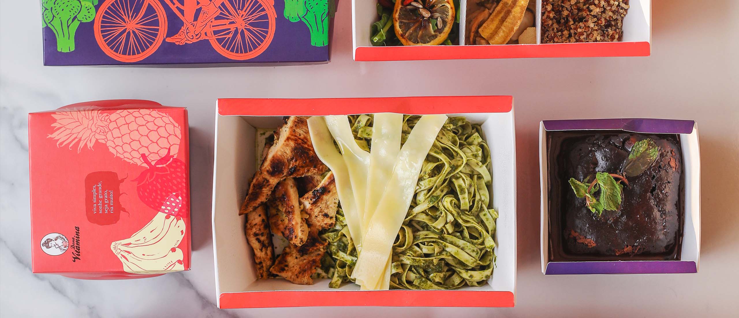
Ten years after Laika created it, Dona Vitamina needed a new visual language, one that kept its original humour and strengthened the female empowerment that was there from the start.
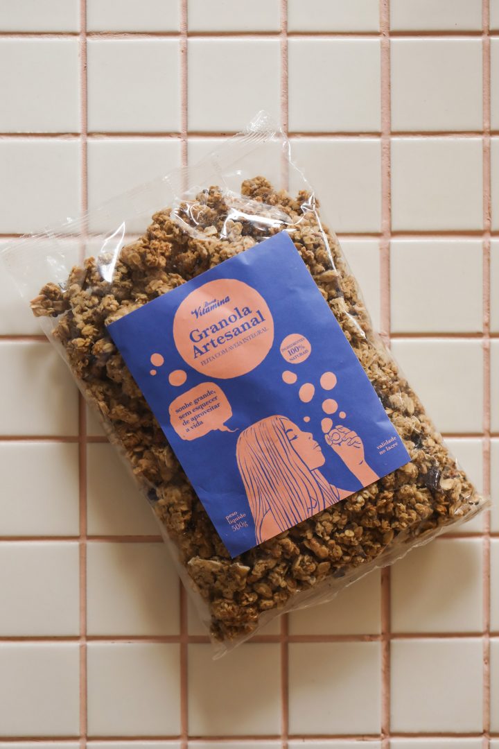
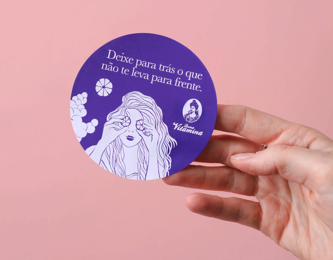
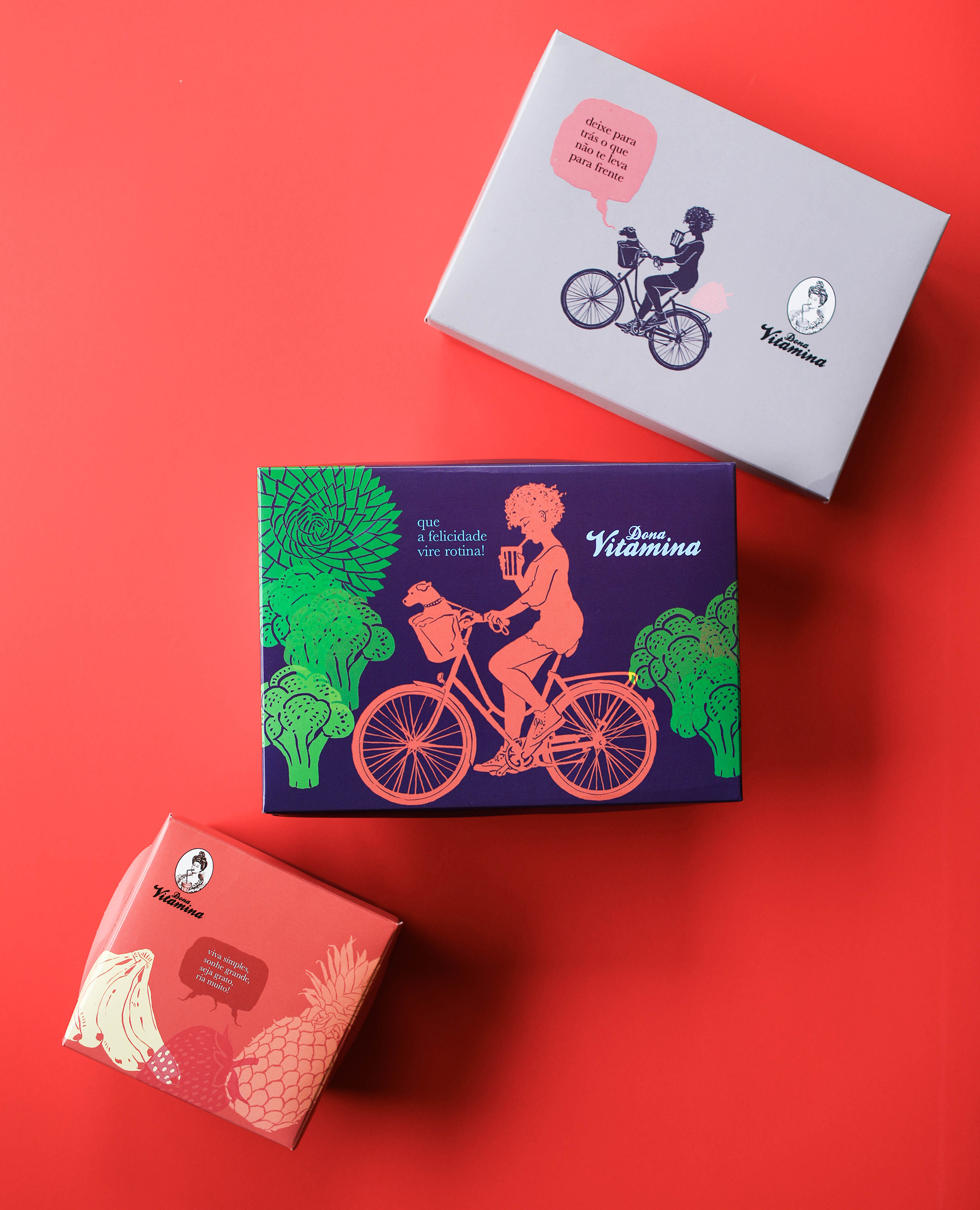
Laika created a series of narratives with women, other Donas Vitaminas, which contemplate other ethnicities and feminine manners. However, always maintaining the disruptive essence of the brand – the logotype is a Victorian lady sipping a juice and cross-eyed. Scattered across surface design, packaging, menus and more, these women are the epitome of the brand’s fun and timeless spirit.
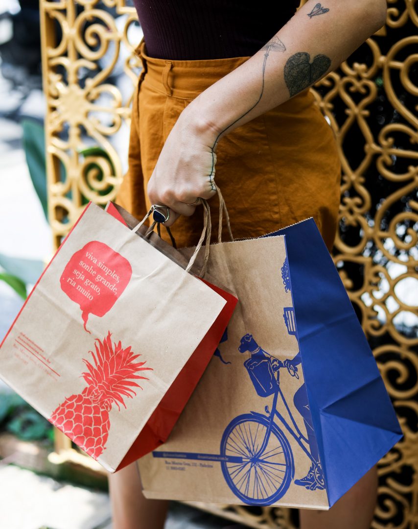
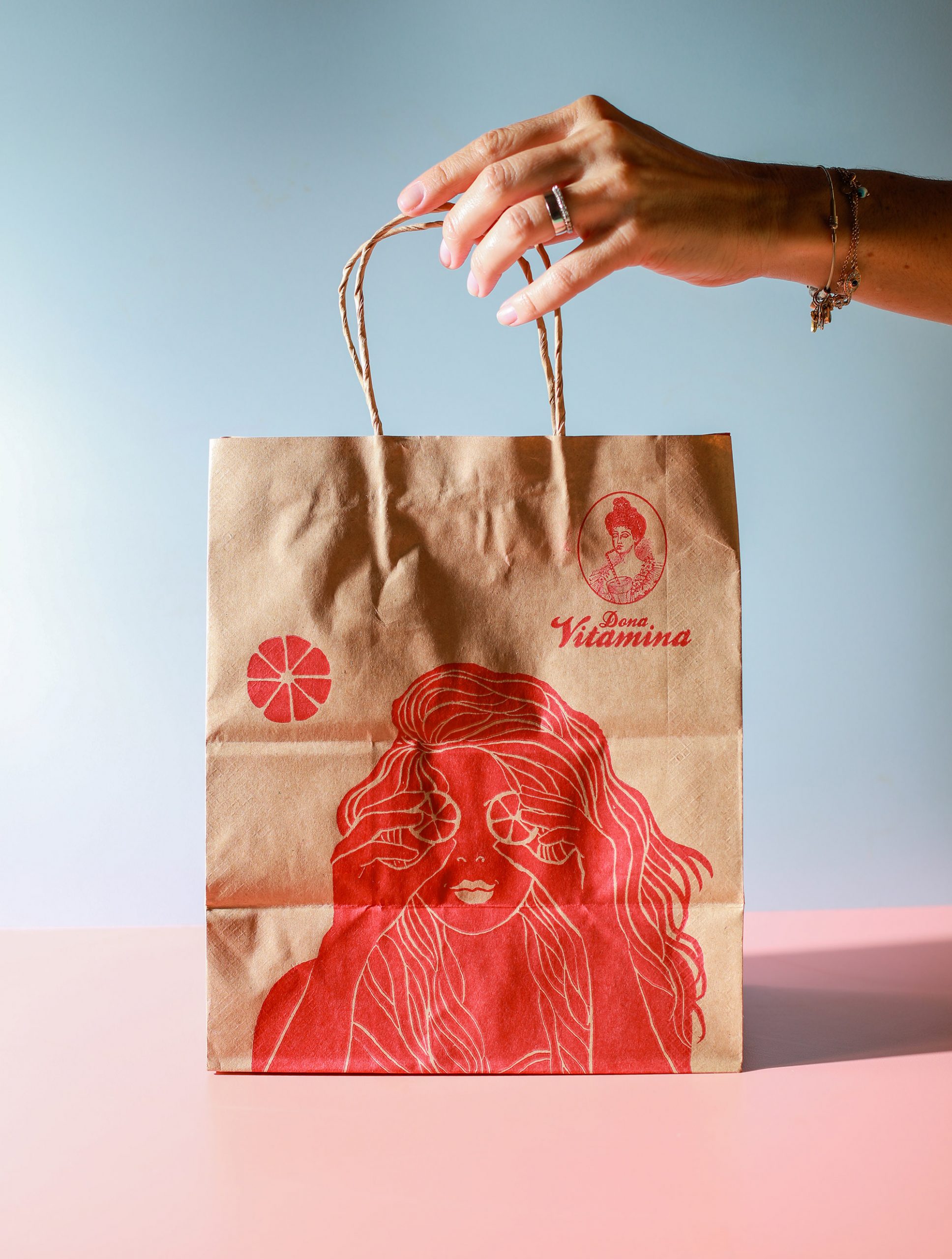
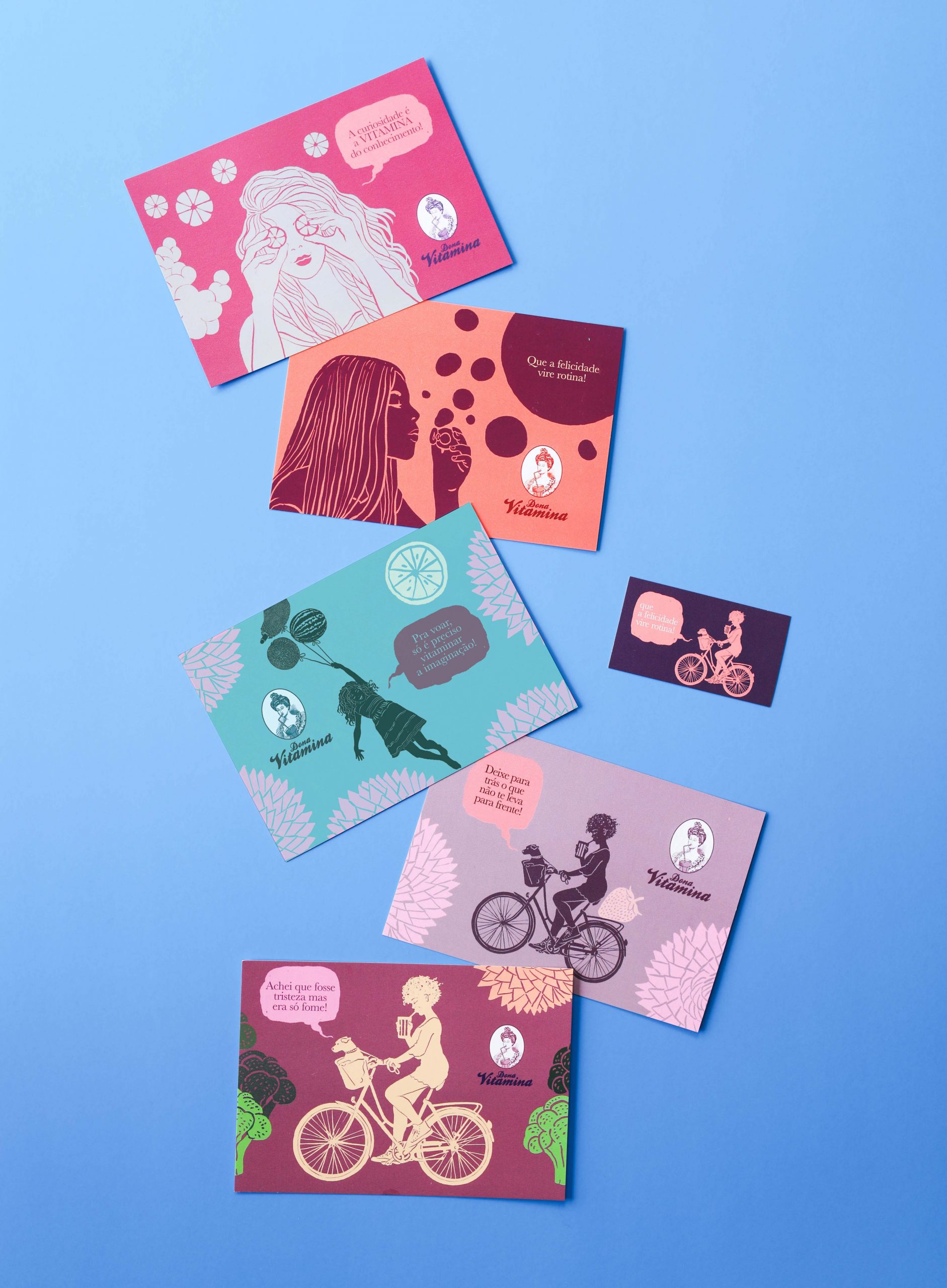
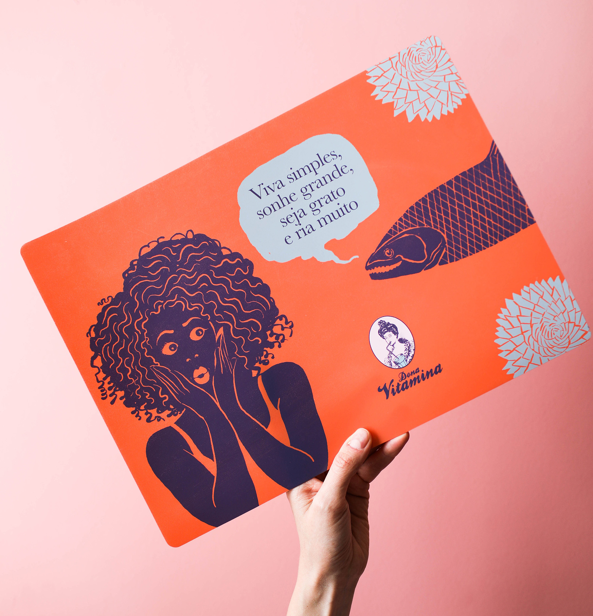
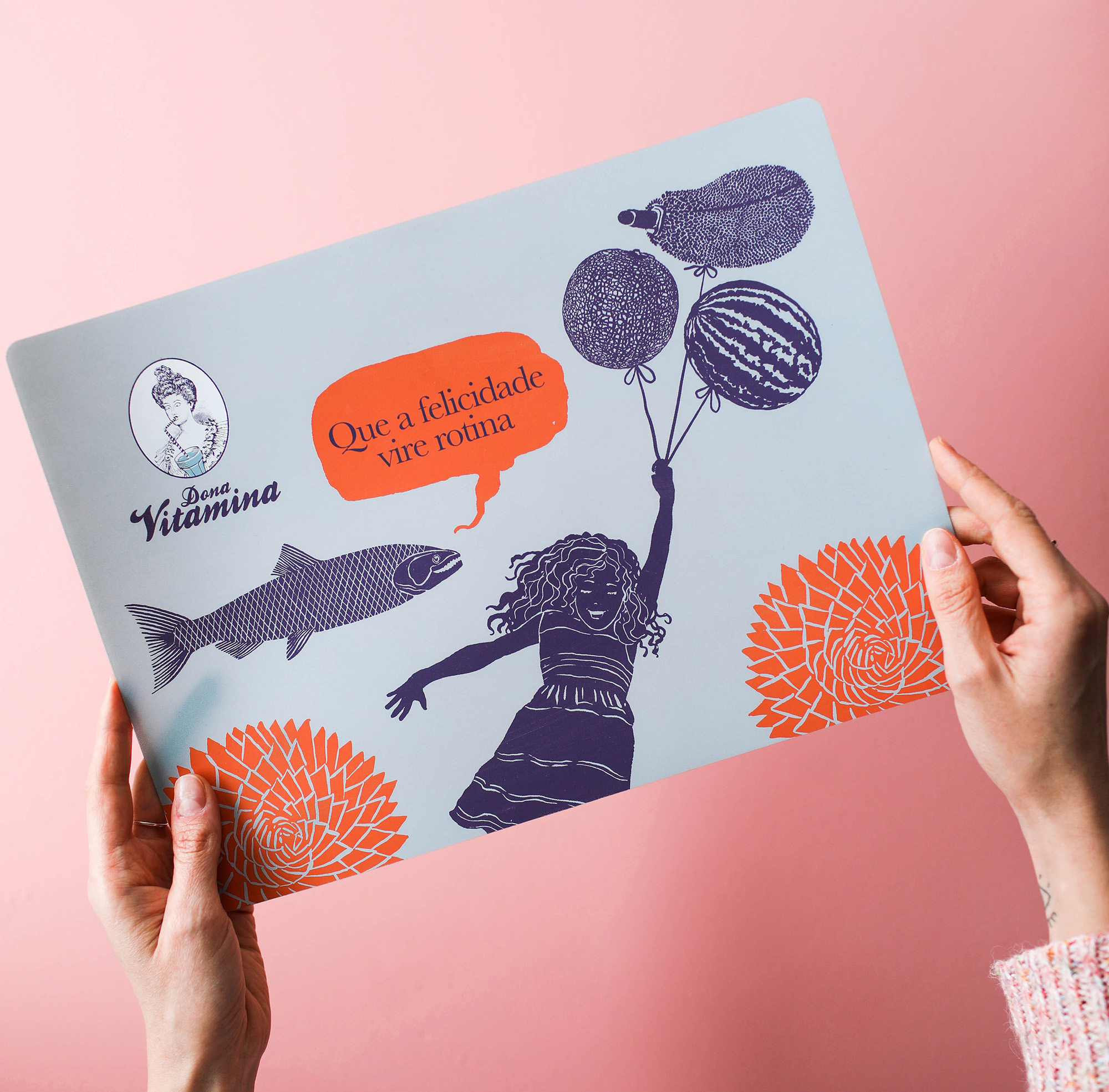
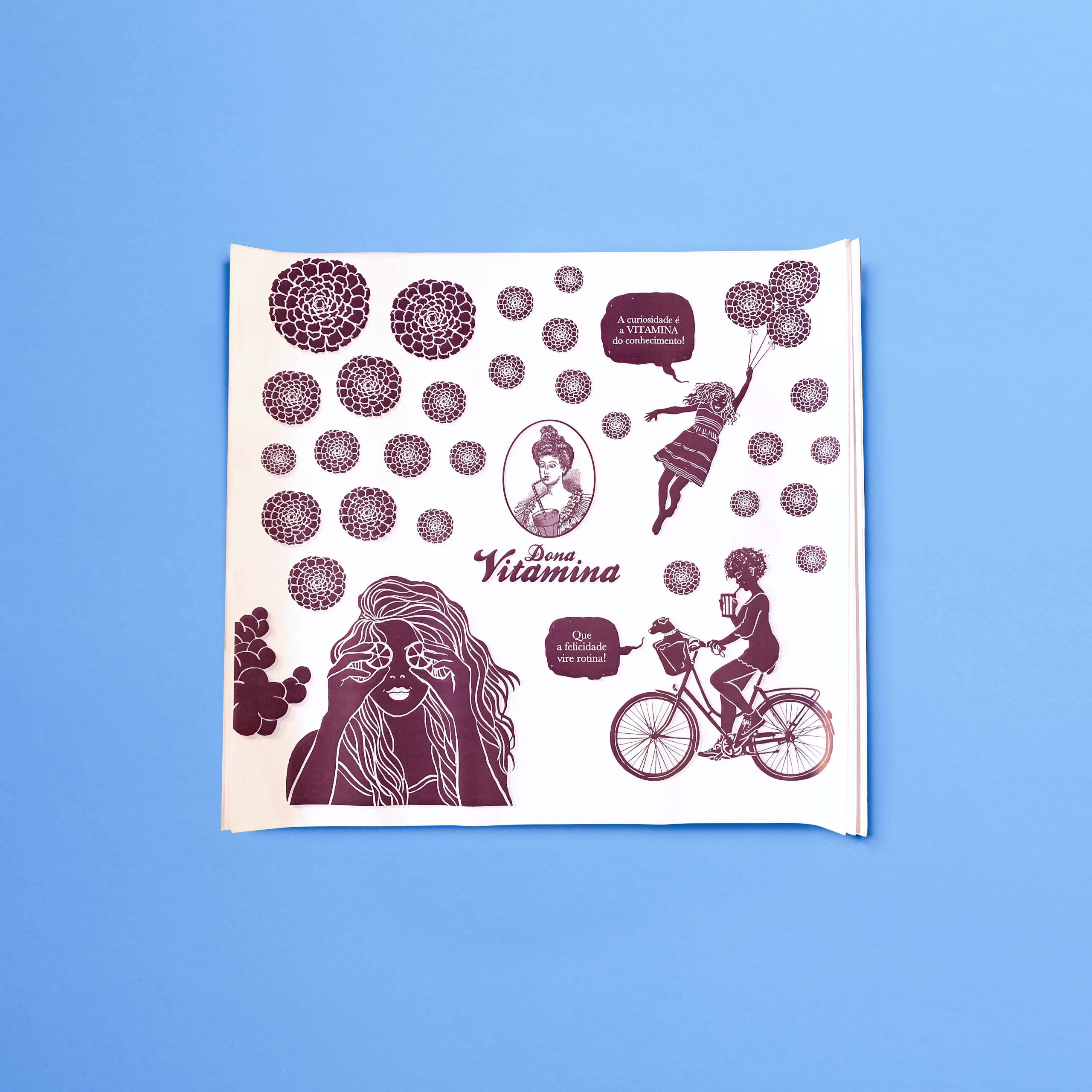
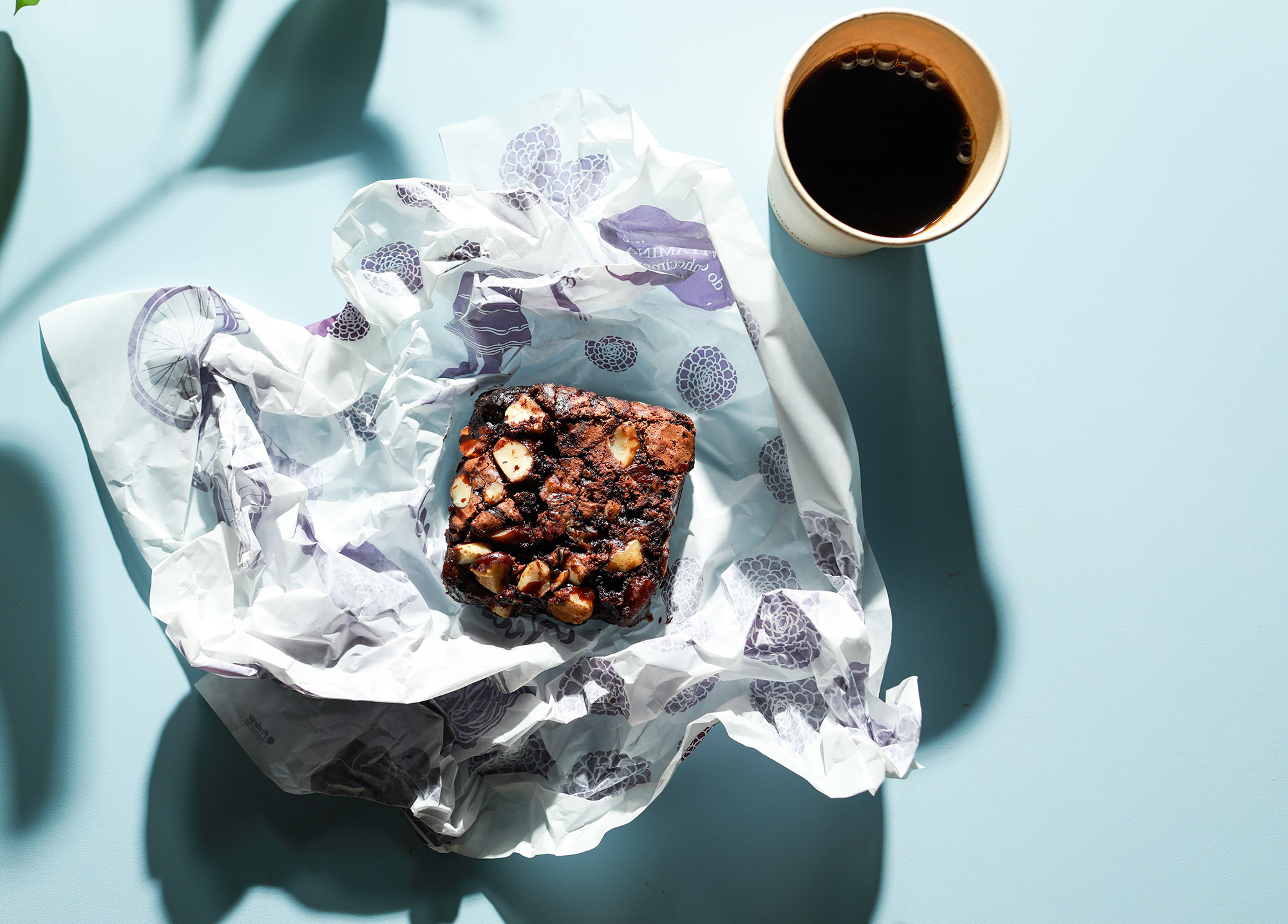
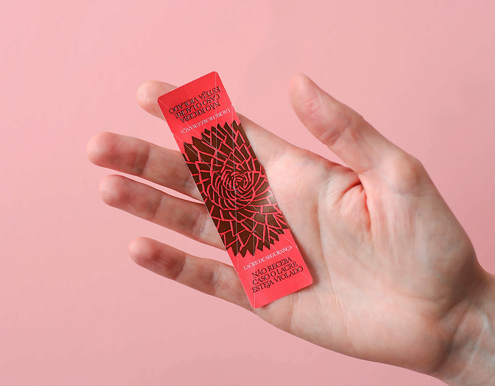
The traditional phrases of Dona Vitamina gain movement with small motion graphics, start inviting photos to be shared on social media – especially on the playful placemats – and expand to delivery, reaching customers’ homes.
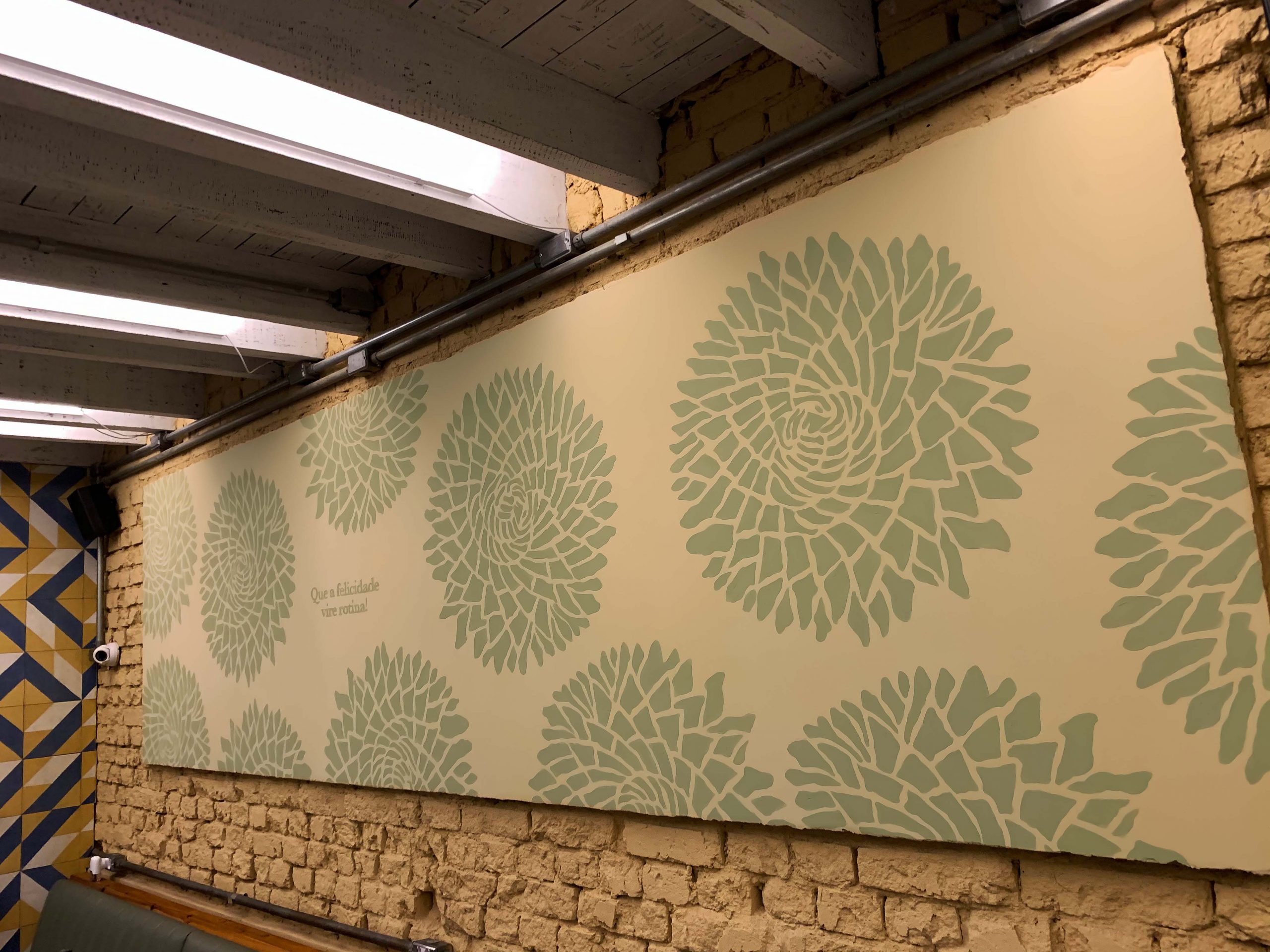
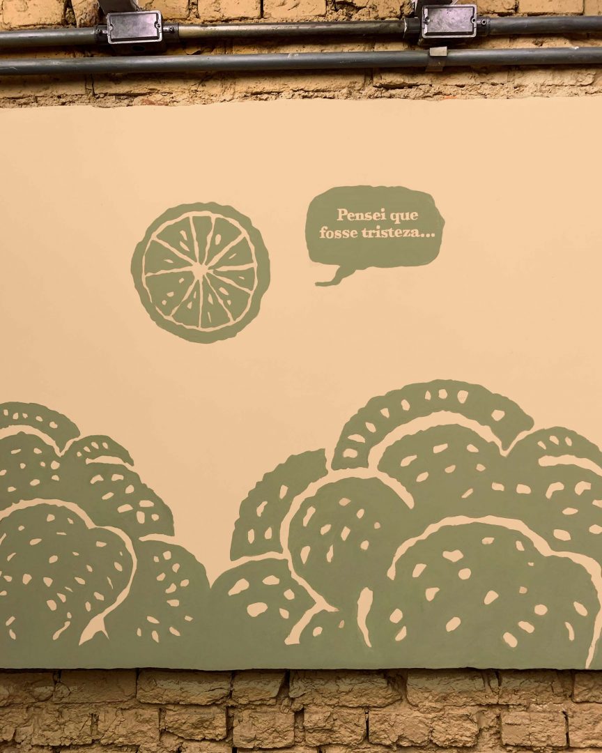
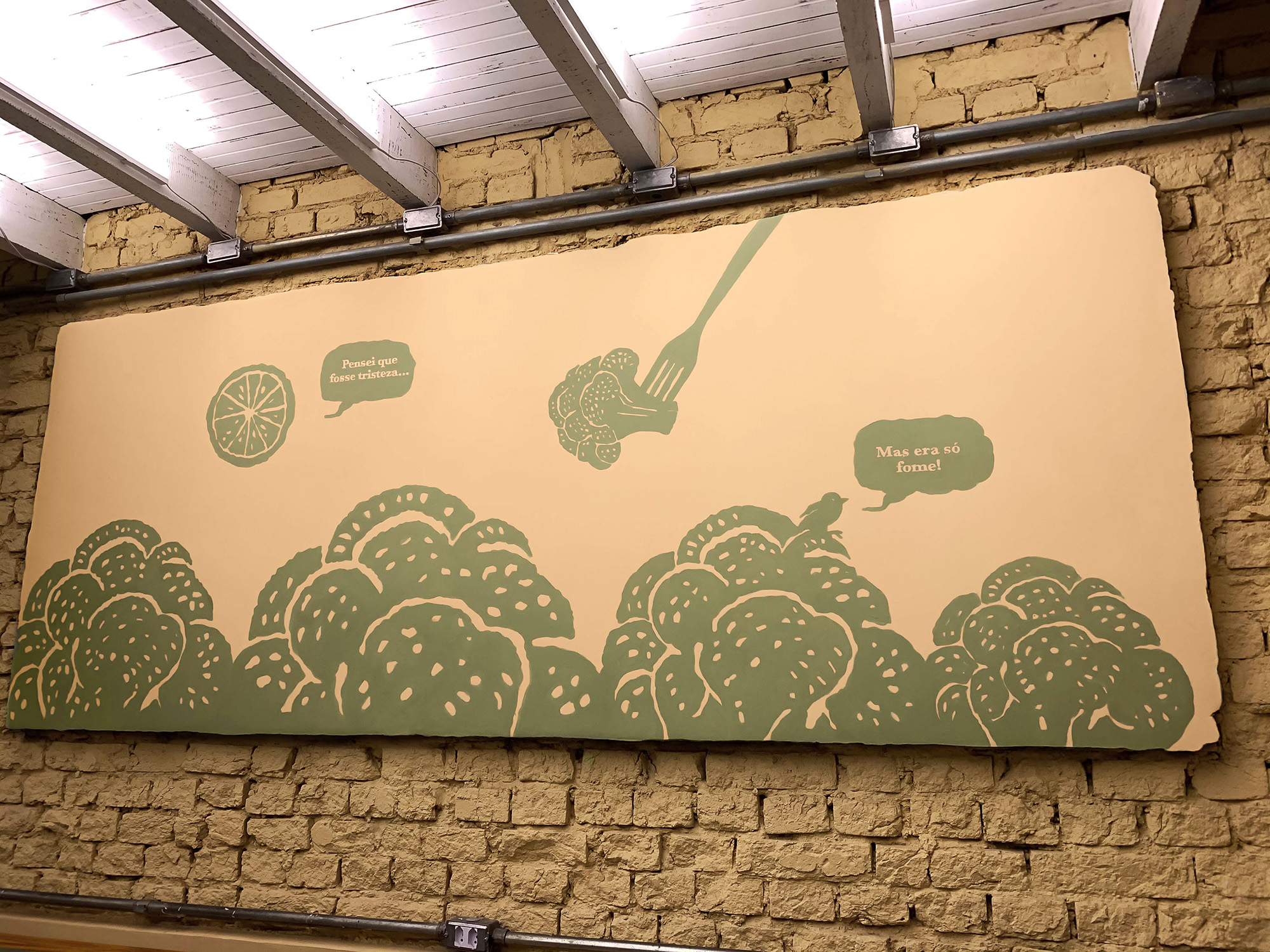
The occupation of the restaurant space happens with murals produced with a lot of paint and brushes by Laika, creating a dialogue between the brand elements with the interior design and the architectural project.